The waiting room is already a stressor. The intake process shouldn't add to it.
ER waiting rooms operate under pressure by design. Patients arrive in pain, disoriented, or anxious. Triage nurses are overloaded. The intake process includes collecting medical history, logging symptoms, and capturing physiological data; the stress happens in a context where cognitive load is already at a peak.
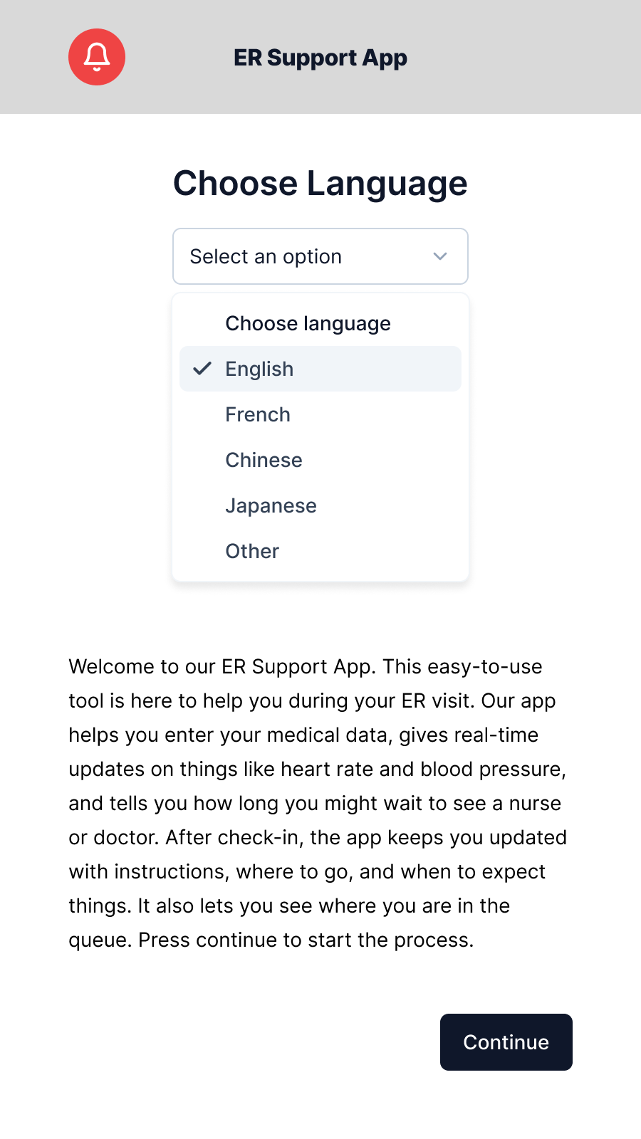
The brief: design a medium-fidelity kiosk prototype that digitizes this intake process without replacing the triage nurse. A support tool, not an automation. Voluntary. Assisted by a trained care provider when needed. Built with accessibility as a primary constraint, not an afterthought.
The design constraints pulled in two directions at once. An emergency kiosk needs to be fast enough for someone in distress to complete, but thorough enough to give a triage nurse clinically useful data. Too many fields and a patient struggling with pain or confusion abandons it. Too few and it fails the clinical purpose entirely.
ContextWhat the app does, and what it deliberately doesn't.
The app operates at a specific point in the care journey: after a patient arrives at the ER, before they are seen by the triage nurse. It runs on a hospital kiosk and is designed for use alongside a trained support care provider, present but not required for every step.
Five functions, in sequence:
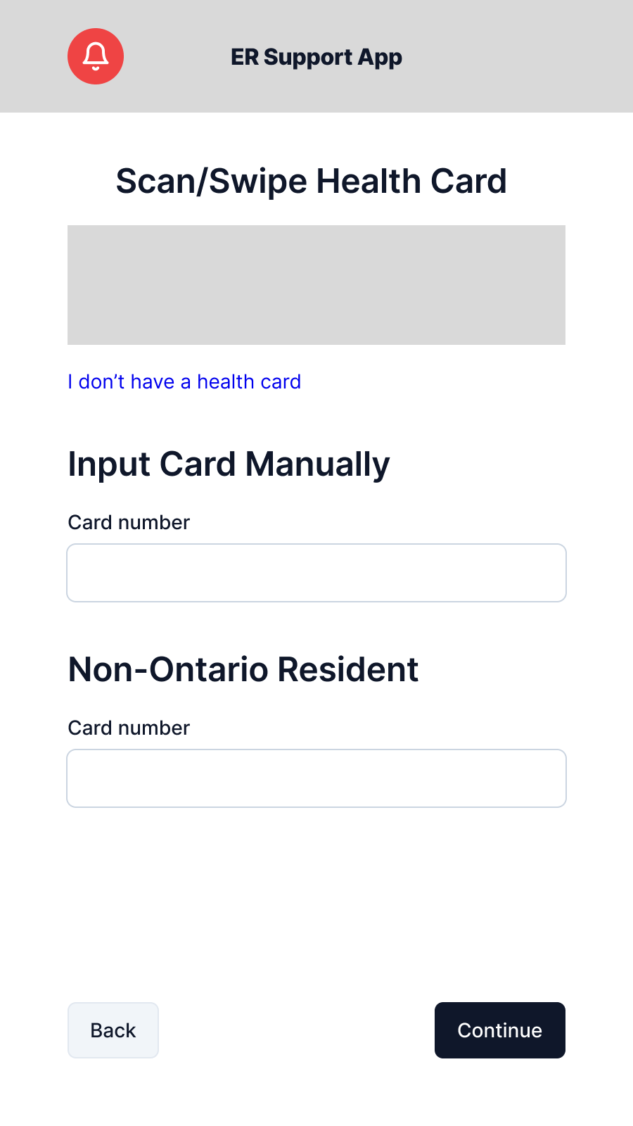
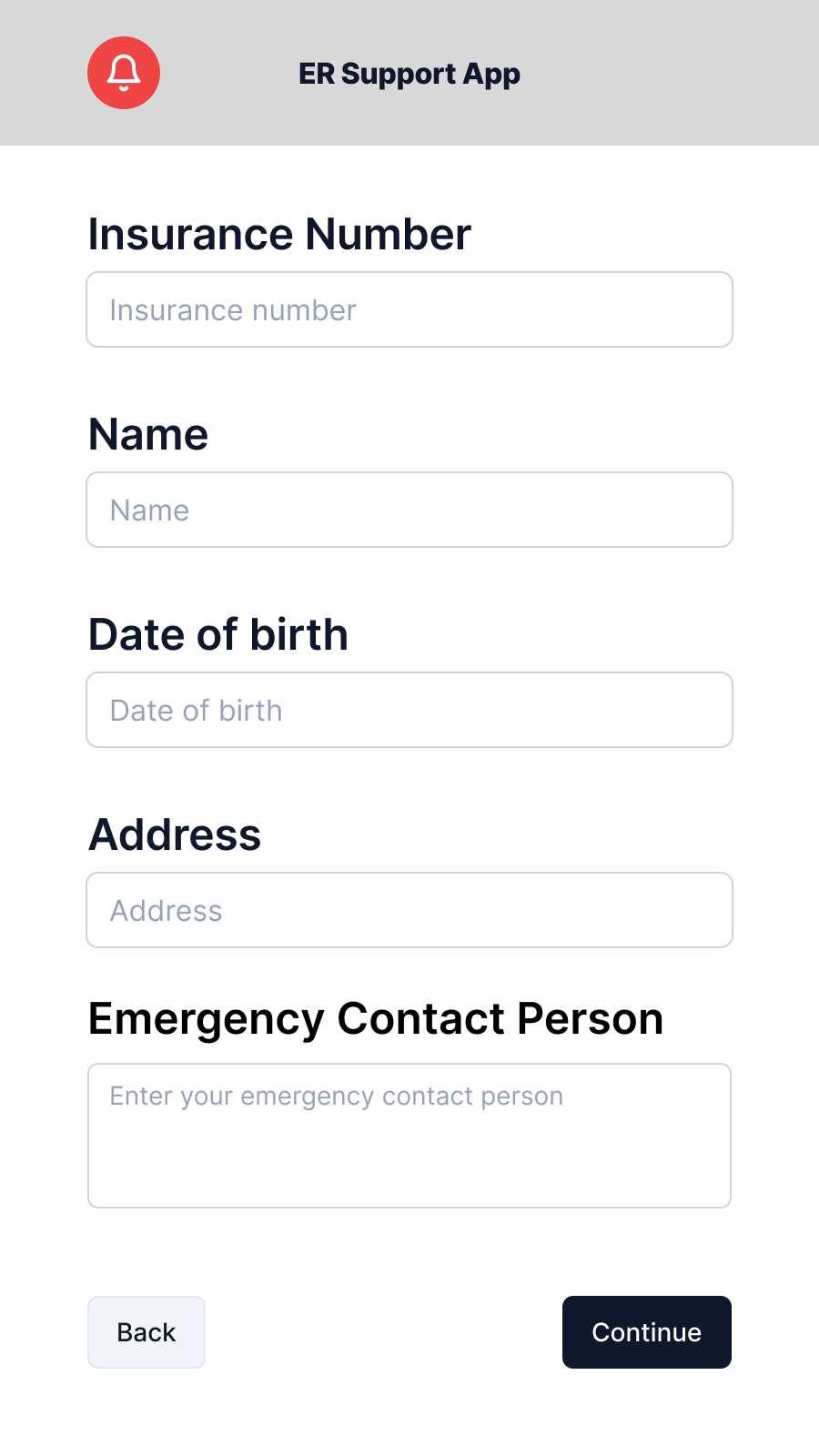
- Personal intake: name, date of birth, address, emergency contact, insurance number, and health card number (with scan and manual entry options) to get the patient's existing records for the triage nurse before they even start the assessment.
- Physiological data collection: heart rate, heart rate variability, blood pressure captured via the kiosk
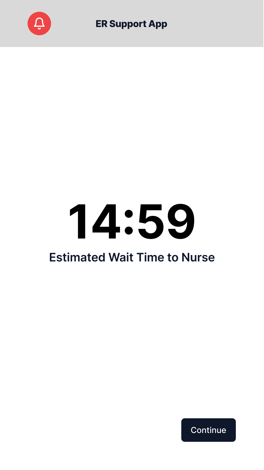
- Wait-time visibility: real-time estimated wait time to triage nurse or doctor
- Queue placement: patient position in queue, updated based on intake priority
- Post-checkin guidance: instructions, location directions, and timeline updates after intake completes
The voluntary and assisted-use model shaped every screen. Not every patient can complete this without help. Some are in too much pain to read carefully. Some have accessibility needs. Some are uncertain about their own medical history. The design had to accommodate the worst-case user in a worst-case moment, without making the experience feel like it was designed only for extreme cases.
Designing for distress.
The prototype covers the full intake journey in 11 frames. Every design decision was tested against one question: could a person who is scared, in pain, or unfamiliar with hospital systems complete this step without stopping?
Personal intake
Health card is the first step deliberately. In Ontario, the health card number is the primary identifier that ties a patient to their existing records. By getting it at entry means the triage nurse starts with context rather than scrambling for it mid-assessment. The screen offers both a scan option and manual entry; not every patient carries their card, and forcing a scan failure moment on someone already in pain is a poor start to the experience.
The remaining intake screens collect name, date of birth, address, and emergency contact, broken into labelled sections. The prototype consolidates some fields that a production build would split further to reduce per-screen density.
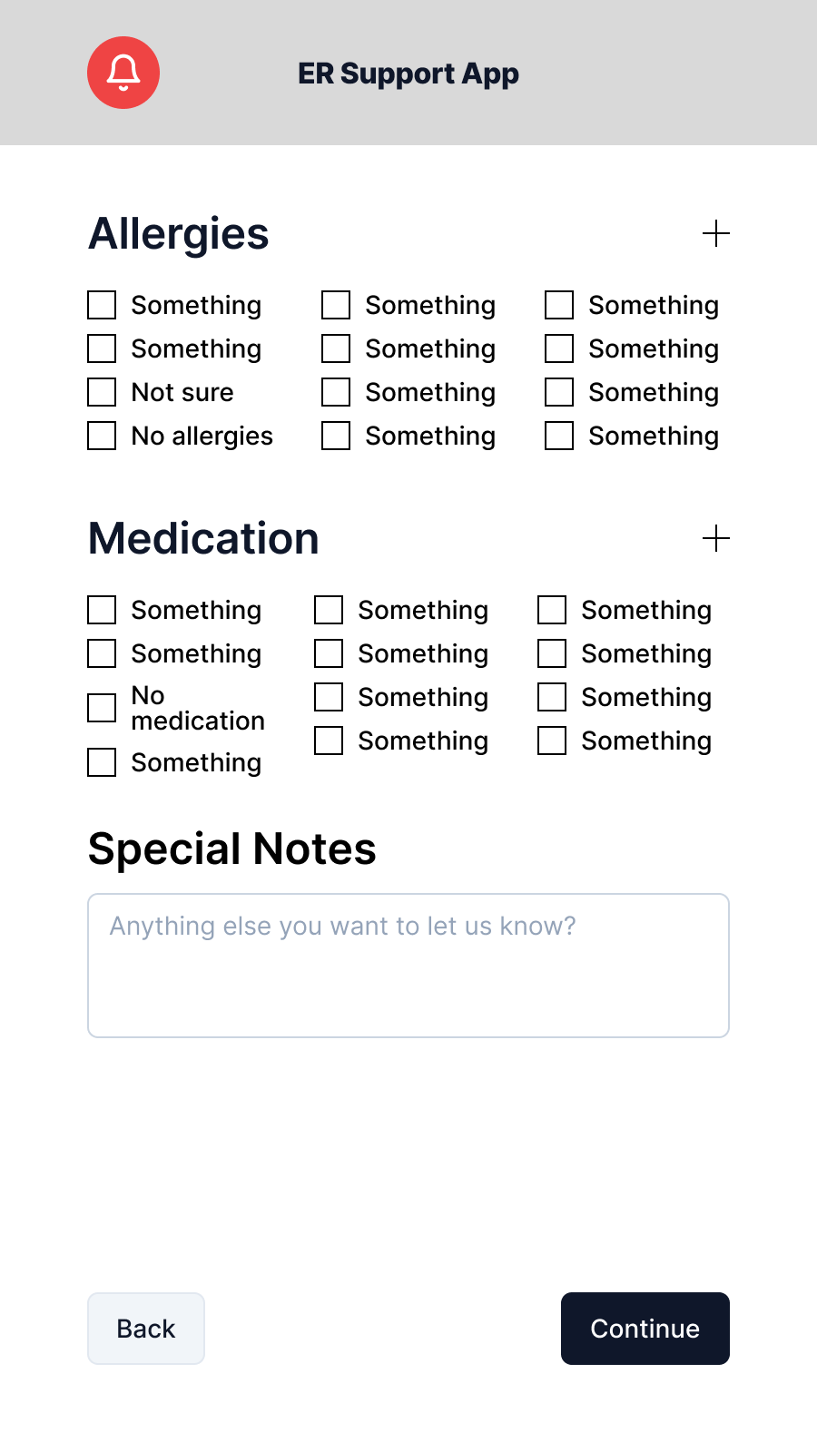
Allergy selection: the hardest screen
The allergy section was the most difficult to design. Allergy data is clinically critical, but the universe of possible allergens is large. Too many options creates the exact cognitive overload the app is meant to avoid; too few risks missing a critical input.
The approach: common allergens surfaced first in a compact grid, a searchable list for specifics, an explicit "I'm not sure" option for patients who can't recall under stress, and a care provider escalation path that's always visible. This escalation is not a buried escape; it is presented as a first-class option on the screen.
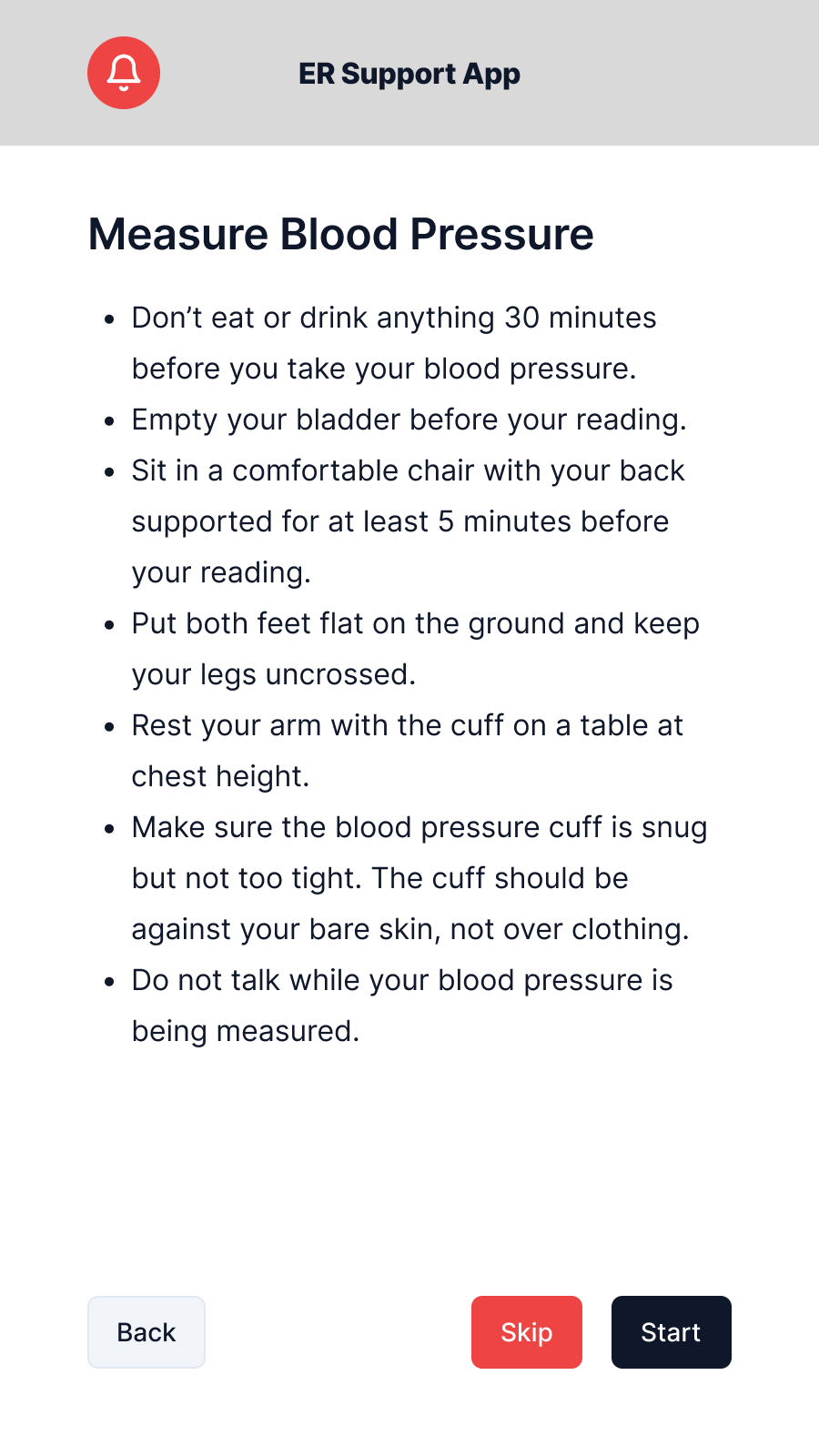
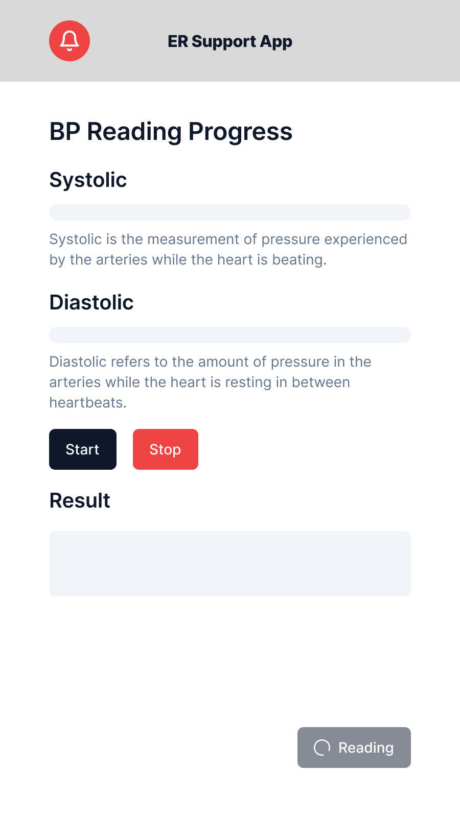
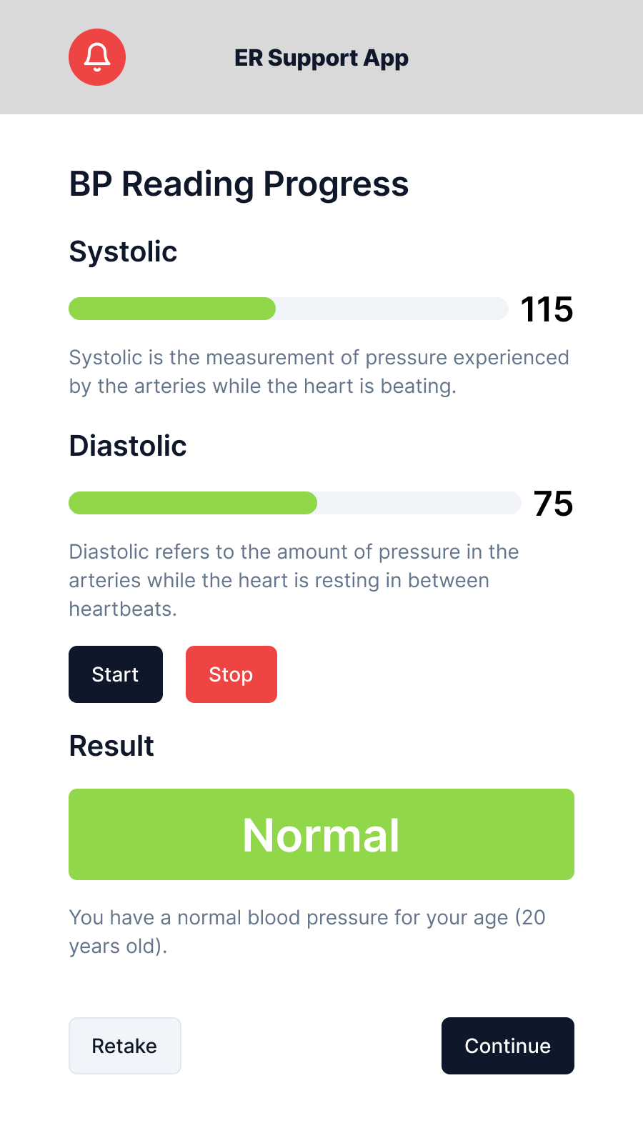
Physiological data
Blood pressure is captured via a built-in kiosk cuff, walked through a three-step flow: positioning instructions, live measurement with a progress animation, then a results screen. The design priority throughout was reassurance because patients don't know their normal baselines, and displaying raw numbers without framing creates anxiety. Results are labelled as data recorded for the care team, not metrics to interpret.
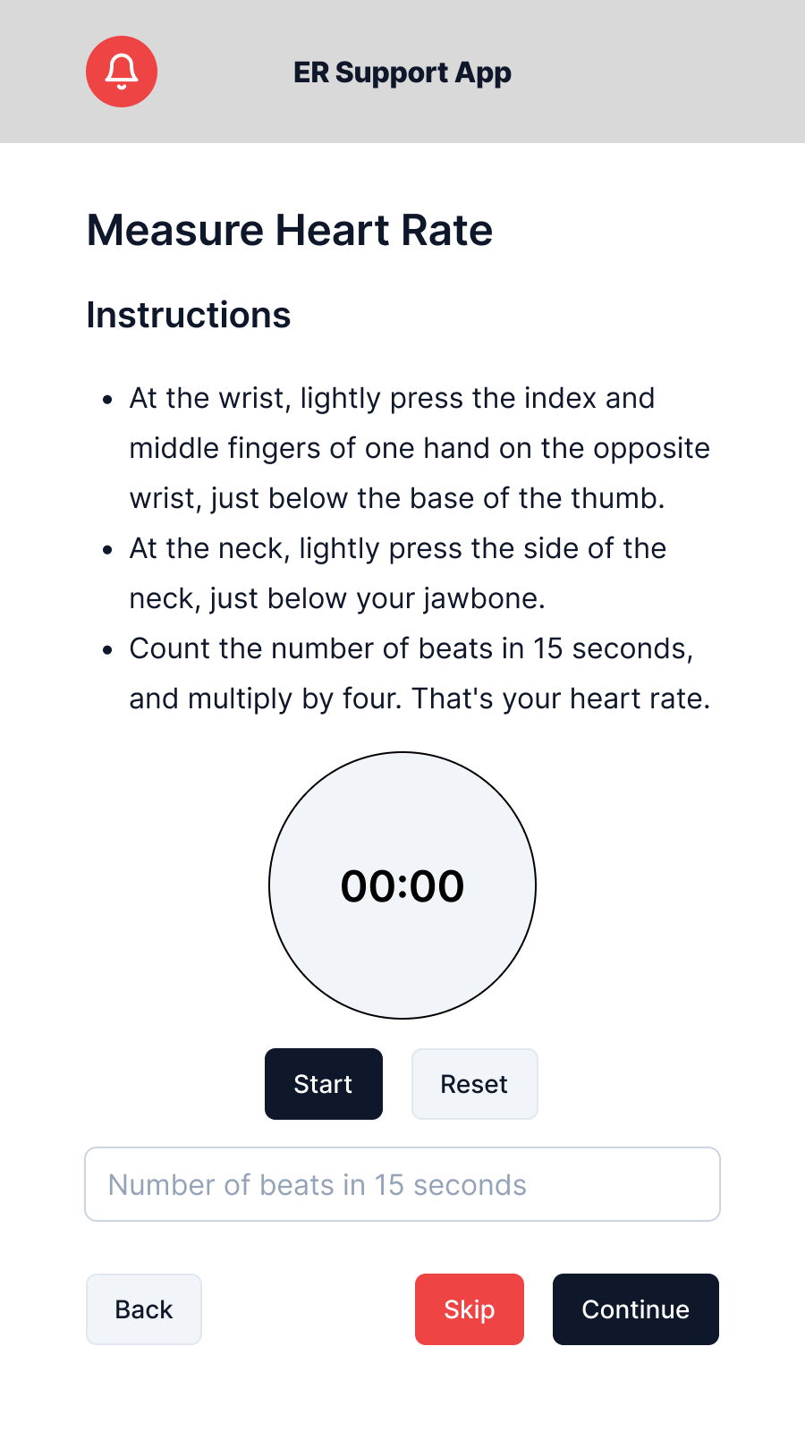
Heart rate is handled differently. The kiosk has no built-in HR sensor, so patients self-measure using a fingertip pulse and enter the count manually. The instructions screen walks through the method step by step with a field to submit the result. Which means no sensor dependency, no failure state if hardware isn't present.
Wait time and queue placement
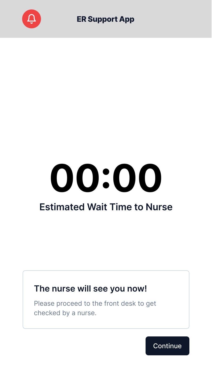
After intake, patients see their estimated wait time and position in queue. Queue position is recalculated based on intake priority scoring. A patient whose vitals flag a concern moves up automatically. The screen is built for repeated glancing: large text, minimal information, auto-refreshing with no required user action.
When the patient reaches the front of the queue, a notification-type modal fires with instructions to proceed. This removes ambiguity about whether the patient missed their turn by stepping away from the kiosk.
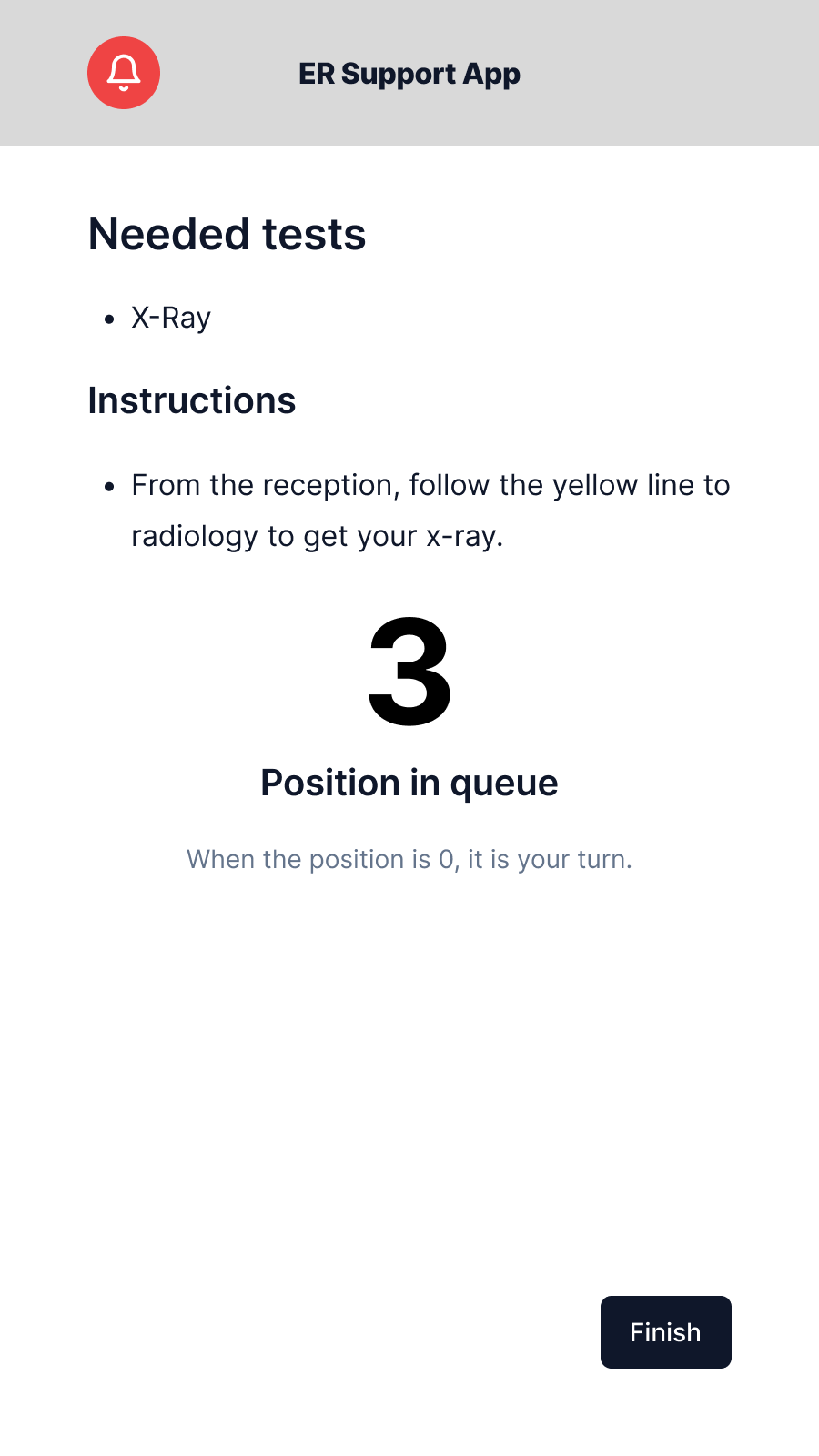
The queue screen also surfaces any preliminary instructions the triage team has assigned based on intake data. For example, the directions to a specific area such as radiology, so patients can act before reaching the nurse's desk rather than receiving all instructions verbally at once.
Peer usability test: SUS 85.
I ran a single-participant peer usability test with Kevin, a tech-literate peer with no prior exposure to the prototype. Before the session, I explained the scenario ("you are a patient who just arrived at an ER"), the session format (think-aloud, no guidance from me during tasks), and what the System Usability Scale (SUS) questionnaire would ask afterward. Kevin completed the full intake flow and then completed the 10-item SUS questionnaire.
Result: 85 (Grade B), "Good", above average by conventional SUS benchmarks.
The score places the prototype in the upper end of the "B" band. By conventional SUS interpretation, this is acceptable and clearly above average, though there is still room to reach the "excellent" threshold above 90.
Kevin's feedback
What was working:
- Design consistency was noted immediately: the prototype felt like a single product. Consistent typography, layout structure, and colour use across all 11 frames meant no screen felt foreign once the first two established the pattern.
- Information display was clear. Kevin could identify what each screen was asking without re-reading; the information hierarchy was doing its job.
What needed improvement:
-
Registration complexity: the overall intake process had too many steps for a patient in a rush or in pain. Even in a low-stress test environment, Kevin found the sequence longer than expected. In a real ER context, many patients would require care provider assistance to complete the full flow.
-
Allergy screen overload: the options presented on the allergy screen were overwhelming even under normal conditions. For a patient in an emergency, with accessibility needs, or who is unsure of their allergies, this screen in particular would require external intervention to complete.
-
Visual signifiers: stronger progress indicators and step markers would help patients locate themselves in the process without needing to read through screen content. The kiosk prototype did not include a persistent progress indicator; testers recommended adding a prominent step counter (for example, "Step 2 of 5: Medical History") on every intake screen.
Reading the result
The SUS score and verbal feedback pointed in the same direction: the core experience was solid, but the parts that carry inherent medical complexity, such as allergy intake and multi-step history, were surfacing that complexity to the user rather than absorbing it.
This is a real design problem in healthcare UX. The allergy screen overload and registration complexity aren't purely fixable with layout changes. Medical intake is genuinely complex, and there's a real tradeoff between clinical completeness and patient-facing simplicity. The assisted-use model addresses the worst cases: the care provider is there precisely for these situations. But the design should reduce how often that intervention is needed, and the specific screens Kevin flagged are the ones that most need iteration.
ReflectionWhat I'd change on iteration two.
The allergy screen is the clearest redesign target. Kevin's feedback was accurate: the volume of options displayed at once was wrong for the use context. A more progressive approach, such as asking "Do you have any known allergies? Yes / No / I'm not sure" before presenting specifics, would reduce the initial cognitive load while still allowing thorough collection from patients who can answer confidently. The current design front-loaded the complexity.
Visual signifiers: Kevin's step counter feedback is a quick win I should have included in V1. A persistent "Step 2 of 5: Medical History" label on every intake screen costs almost nothing and makes the process structure visible at a glance — no reading required to know where you are.
Single-participant SUS is the obvious methodological limitation. One person's score of 85 is an interesting data point, not a reliable signal. A sample of 5–8 participants with different ages, tech literacy levels, and language backgrounds would reveal whether the accessibility provisions actually work for the users who most need them: the older patient, the patient in pain, or the patient for whom English isn't the first language.
The broader design lesson I took from this project: most usability work I'd done before targeted users with time and attention to spare. Designing for emergency intake forced me to think about a user whose time, attention, and cognitive capacity are all constrained simultaneously. Every extra step, every extra option, every screen with too much text has a cost that is invisible in a neutral testing room and very real in an ER waiting room.