eBay works. But for a first-time visitor, it barely feels like it.
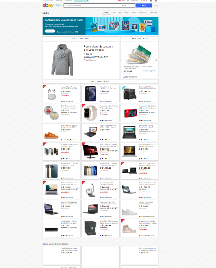
eBay connects buyers and sellers across 190+ markets. For experienced users, that breadth is the point. For anyone new, it's a wall. The navigation bar lists the same category in two places. The page that lets you browse everything is so dense you scroll past what you were looking for. Listings show different information depending on where you find them. Text is grey where it should be black. Auction pricing looks like a sale price until you read the fine print.
None of these are catastrophic in isolation. Together, they add up to an experience that subtly erodes trust with every interaction, raising friction on the path to purchase and lowering the bar for a user to leave.
The brief for this project was to evaluate eBay's human-computer interaction elements and redesign them. Our team's angle: fix the information architecture, reduce noise in the UI, and make the experience readable for all age groups, without stripping away the depth that makes eBay worth using.
Key insights.
Research ran in three stages: usability testing to surface the friction points, card sorts to diagnose the labeling problems, and a tree test to validate the proposed IA changes before prototyping.
Usability testing
Three participants tested eBay on three tasks: listing a Batman Funko Pop, finding VHS tapes under $10, and finding a white Xbox 360 in North America. Participant profiles were chosen deliberately: a tech-literate new user, a tech-literate experienced eBay seller/buyer, and a tech-illiterate new user. This mix surfaced both the onboarding experience and the expert experience.
Key findings across all three:
- All users missed the Sell label on first scan. It was too small and lacked visual weight compared to the surrounding elements.
- All users defaulted to the search bar for browsing tasks, treating categories as a fallback rather than a primary navigation tool.
- When categories were used, they caused confusion; one user navigated into the wrong electronic subcategory before backtracking.
- Auction listings were the biggest point of confusion. "Or Best Offer," number of bids, and time remaining were all grey on white, easy to miss and easy to misread as a fixed price.
Most users rated eBay 9 out of 10 and described only minor inconveniences. That result was instructive: the site's core functionality isn't broken. The problems are in the details that accumulate.
I built a follow-up survey that reinforced this. Of 12 responses, 83.3% rarely or never used eBay, two-thirds (66.7%) rated their experience a 3 out of 5, and just over half rated their likelihood of recommending it to a friend at only 3 out of 5. The site wasn't unusable. It just wasn't giving people a reason to come back.
Card sorting: five studies across five sections
The usability test pointed to friction; the card sorts pinpointed where the labeling was causing it. We ran five separate studies targeting different sections of the site.
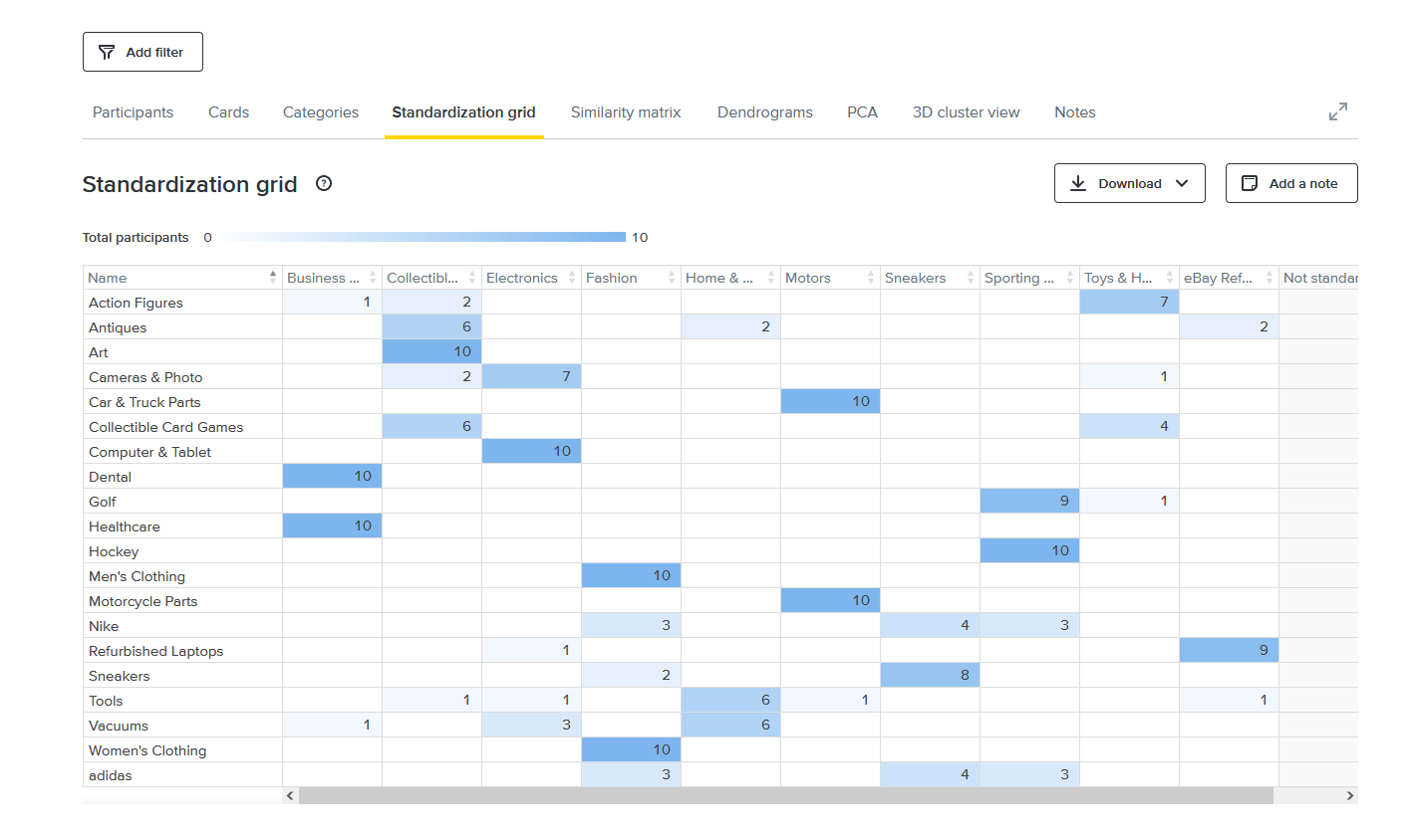
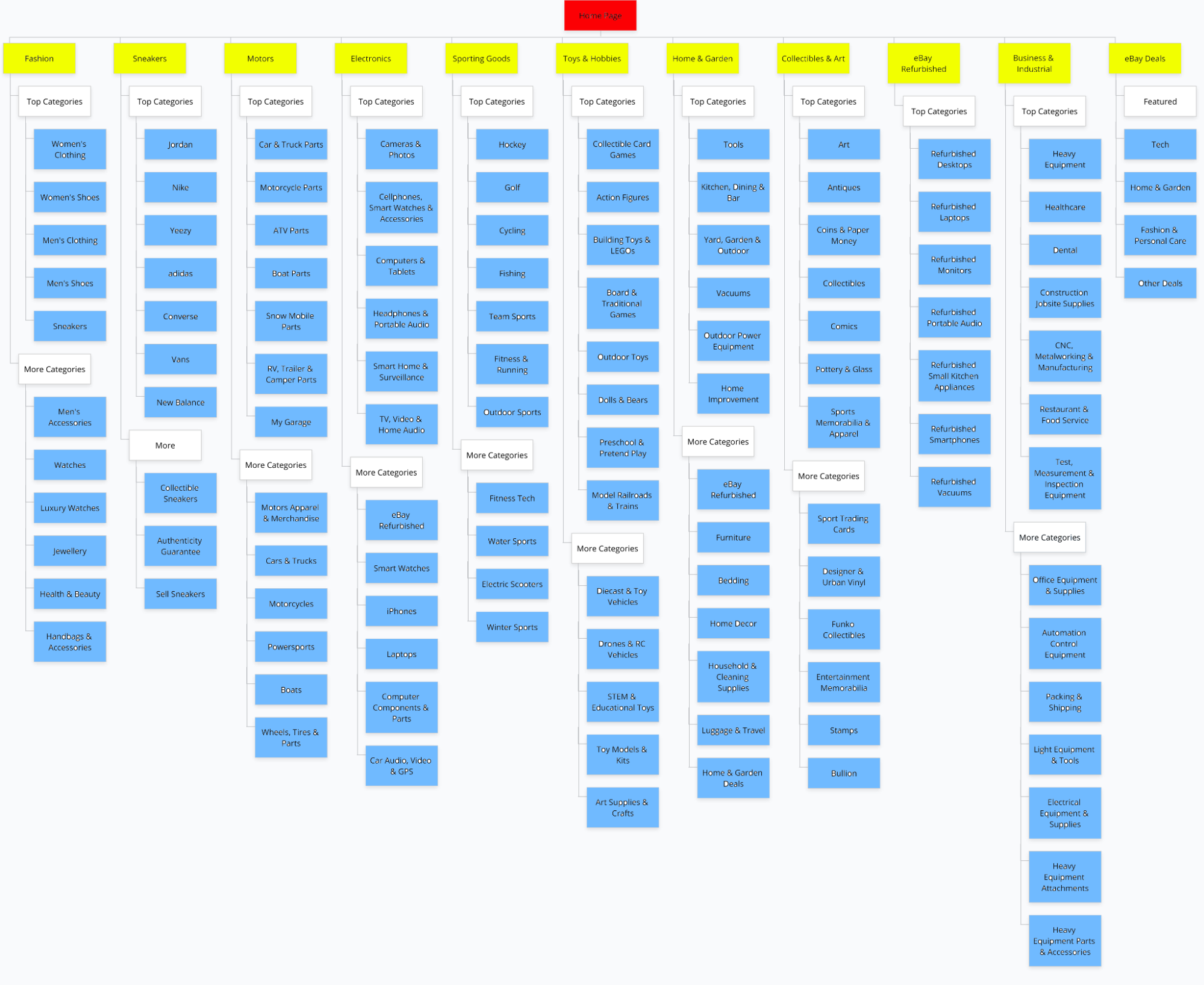
Home page card sort (hybrid, 10 participants, 20 cards)
This was the study I ran. Specific labels like "Art," "Computer & Tablet," and "Hockey" hit 100% agreement. Generic and brand labels broke down fast: "Tools" was sorted into five different categories, and "Nike" and "adidas" split three ways across Sneakers, Fashion, and Sporting Goods. The detail that reframed the project: even experienced eBay users sorted the ambiguous labels inconsistently. This wasn't a new-user problem. The IA was producing friction for people who knew the site.
All categories card sort (open sort)
An open sort on the categories page revealed that users consistently grouped items into three buckets: sports, music, and electronics, but the existing categories didn't map cleanly to those mental models. Electronics was overloaded. Sports memorabilia and vintage movies were buried in categories that didn't signal their presence.
Electronics card sort (open sort, 5 participants)
Participants created their own groupings for the Electronics page subcategories. The consistent themes: phones, computers, smartwatches, and networking. Smart Watches were almost always separated from Cell Phones & Accessories, which was confirmation that they deserved their own top-level category.
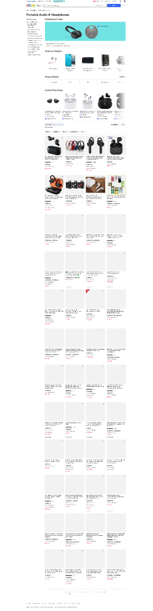
Headphones & Portable Audio card sort (closed sort, 4 participants)
A closed sort with 13 categories and 26 real eBay listings. None of the four participants categorized listings the same way eBay did. The most telling finding: every participant placed an iPod accessory (an iFlash SD adapter) in "Portable Audio Accessories", but eBay had it in "Replacement Parts & Tools," a vague catch-all that wasn't serving anyone.
Deals page card sort (open sort)
Users found the Deals section disorganized. Technology deals were scattered across the page instead of consolidated. Users created their own "technology" and "collectibles" groupings, which didn't exist as explicit categories. Several experienced eBay users still couldn't classify items confidently, confirming the section needed explicit subcategory structure.
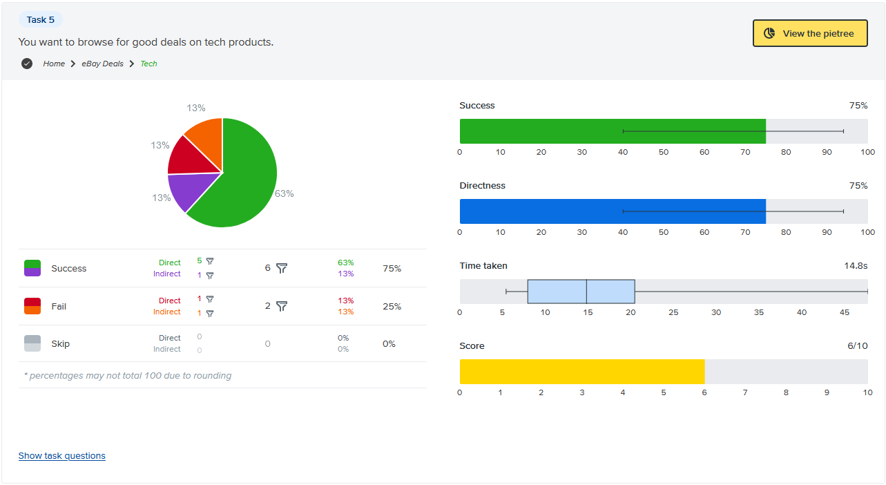
Tree testing the revised IA
After applying card sort findings to the IA, we ran a tree test to validate the changes before prototyping. Nine participants, eight completed all five tasks.
Overall: 95% success rate, 75% direct success (no backtracking).
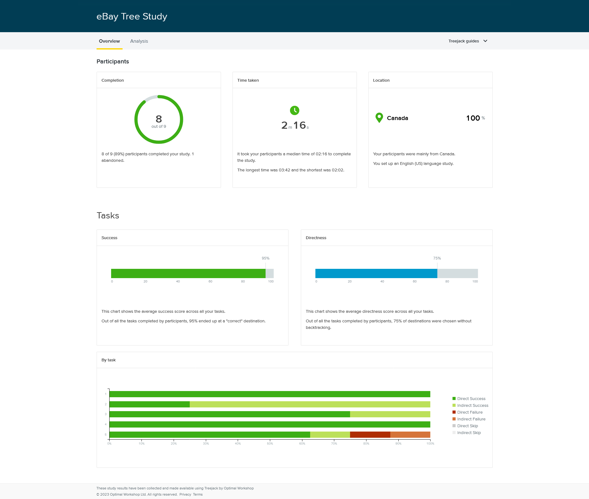
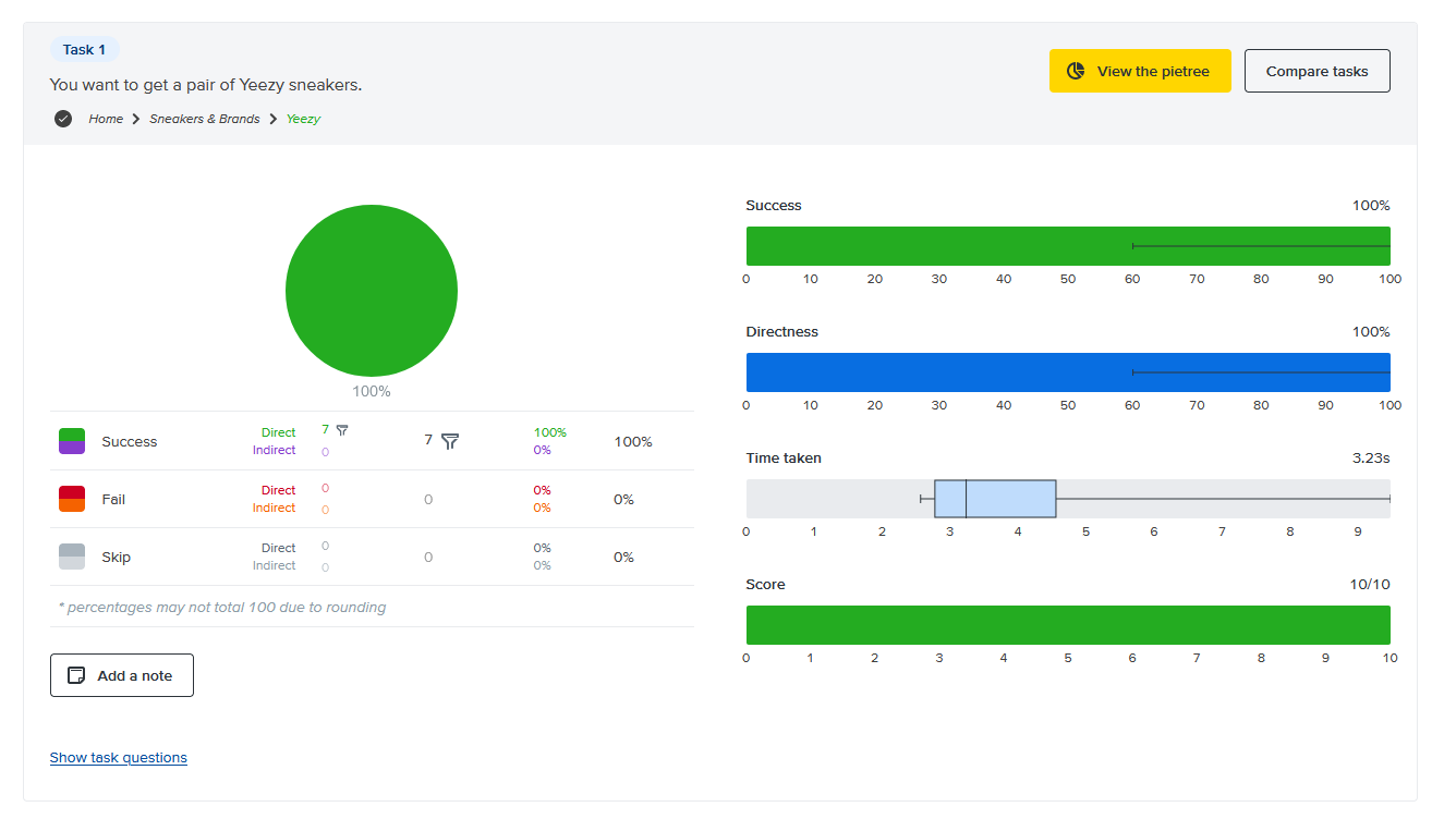
The rename from "Sneakers" to "Sneakers & Brands" was immediately validated: all eight participants found Yeezy sneakers without a single wrong click.
The one failure point: Task 5 (browse tech deals) had a 25% failure rate. Users went to Electronics instead of eBay Deals; both are defensible paths. The fix wasn't to restructure; it was to add a Tech Deals link inside the Electronics dropdown, giving users a bridge between the two.
Design exploration.
With five card sorts and a tree test behind us, every IA change had a specific finding behind it. No guessing, no gut calls.
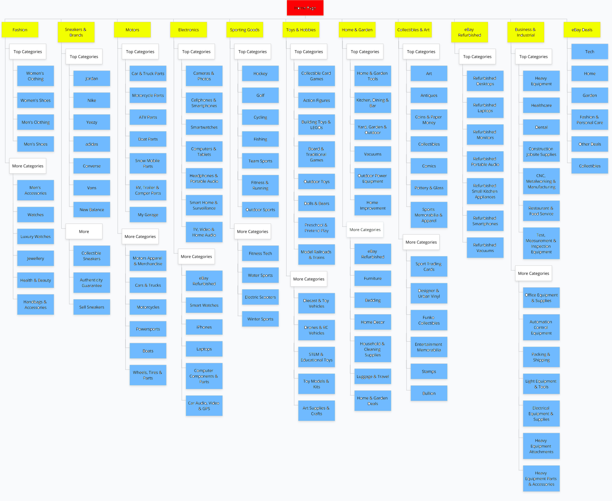
IA restructuring
Home page:
- Removed the "Sneakers" subcategory from Fashion, pure duplicate of the top-level Sneakers link
- Renamed "Sneakers" top-level to "Sneakers & Brands" to cover Nike and adidas without ambiguity
- Renamed "Tools" under Home & Garden to "Home & Garden Tools" to eliminate category confusion
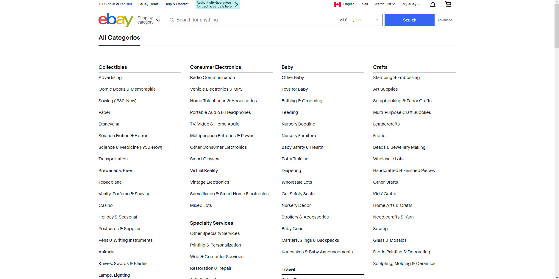
All Categories page:
- Moved vintage movies and sports memorabilia into Collectables
- Renamed "Sports Mem, Cards & Fan Shop" to "Cards & Memorabilia"
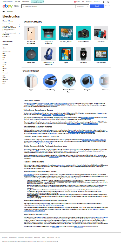
Electronics page:
- Made all subcategory names consistent with each other
- Removed "Mixed Lots" (no clear home for its contents)
- Added "Smartwatches" as a dedicated category, separated from Cell Phones & Accessories
- Removed "Refurbished" as a top-level category, kept it as a filter at the item level instead
- Moved "Shop by Interest" descriptions off the page and behind a "Learn More" button
Headphones & Portable Audio:
- Combined "Headphones Accessories" and "Headphones Parts" into one "Headphones Parts & Accessories" category
- Removed "Replacement Parts & Tools", too vague, causing misclassification
- Renamed "Portable Audio Accessories" to "Portable Audio Accessories & Parts"
Deals page:
- Removed the "Featured" subcategory (cluttering the page with promoted content)
- Added a Collectibles section for rare items
- Added explicit subcategories for technology deals instead of scattering them by discount size
- Split "Home & Garden" into two sections
Post-tree-test addition:
- Added "Tech Deals" to the Electronics dropdown to bridge the navigation gap Task 5 exposed
- Reworked and added account, notifications, and saved/wishlist icon groups in the header
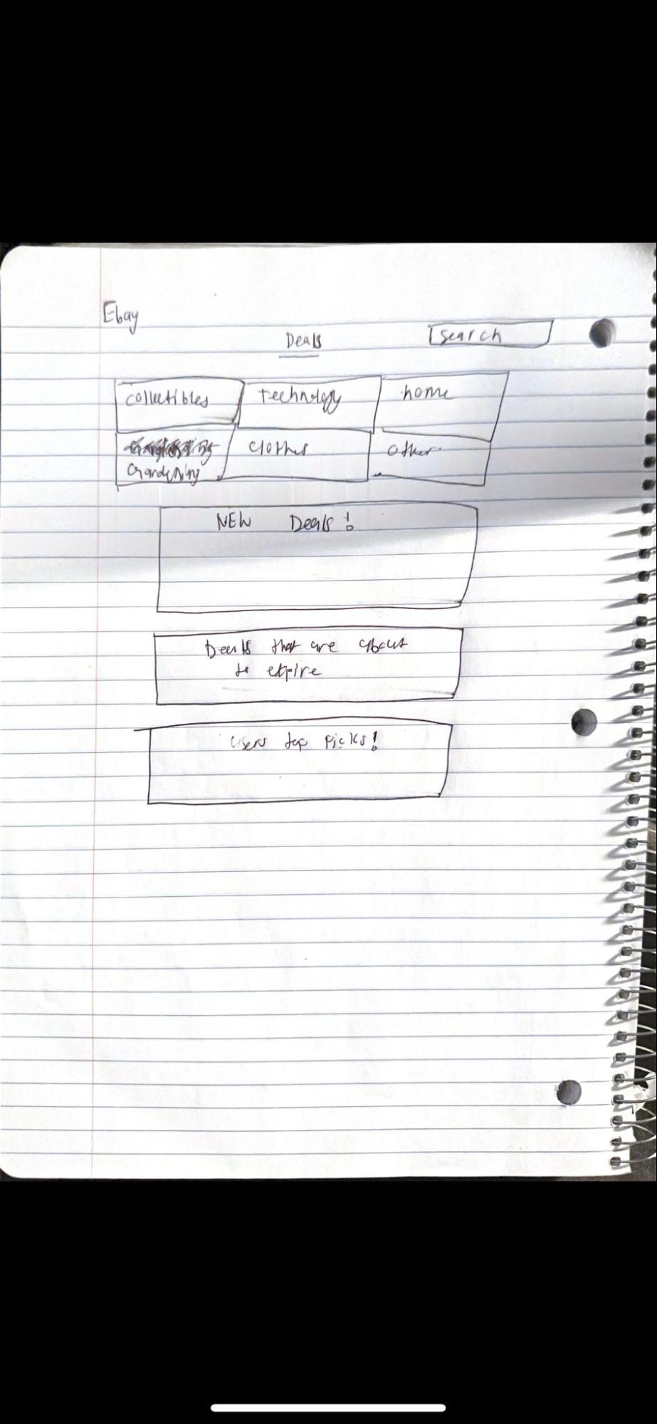
Sketches — translating IA changes into screen decisions
Before building in Figma, we sketched out the changes for each page to work through interaction decisions without getting distracted by visual polish. Five pages, five sketches.
I led the home page Figma design, sketched its wireframes, and created the IA diagrams that visualized the proposed navigation changes.
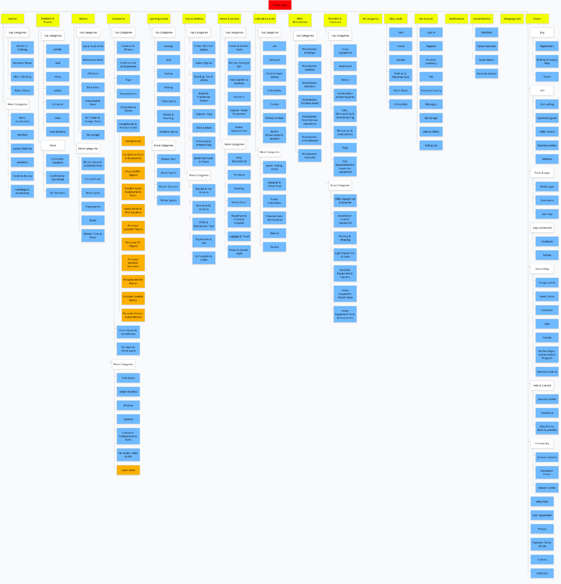
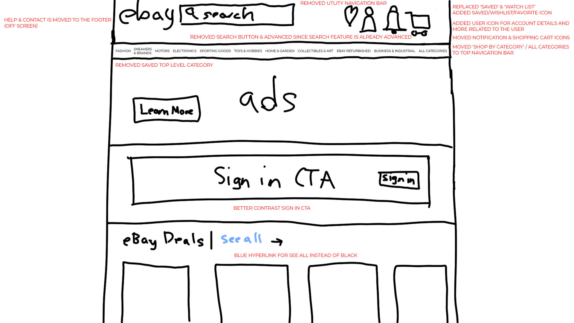
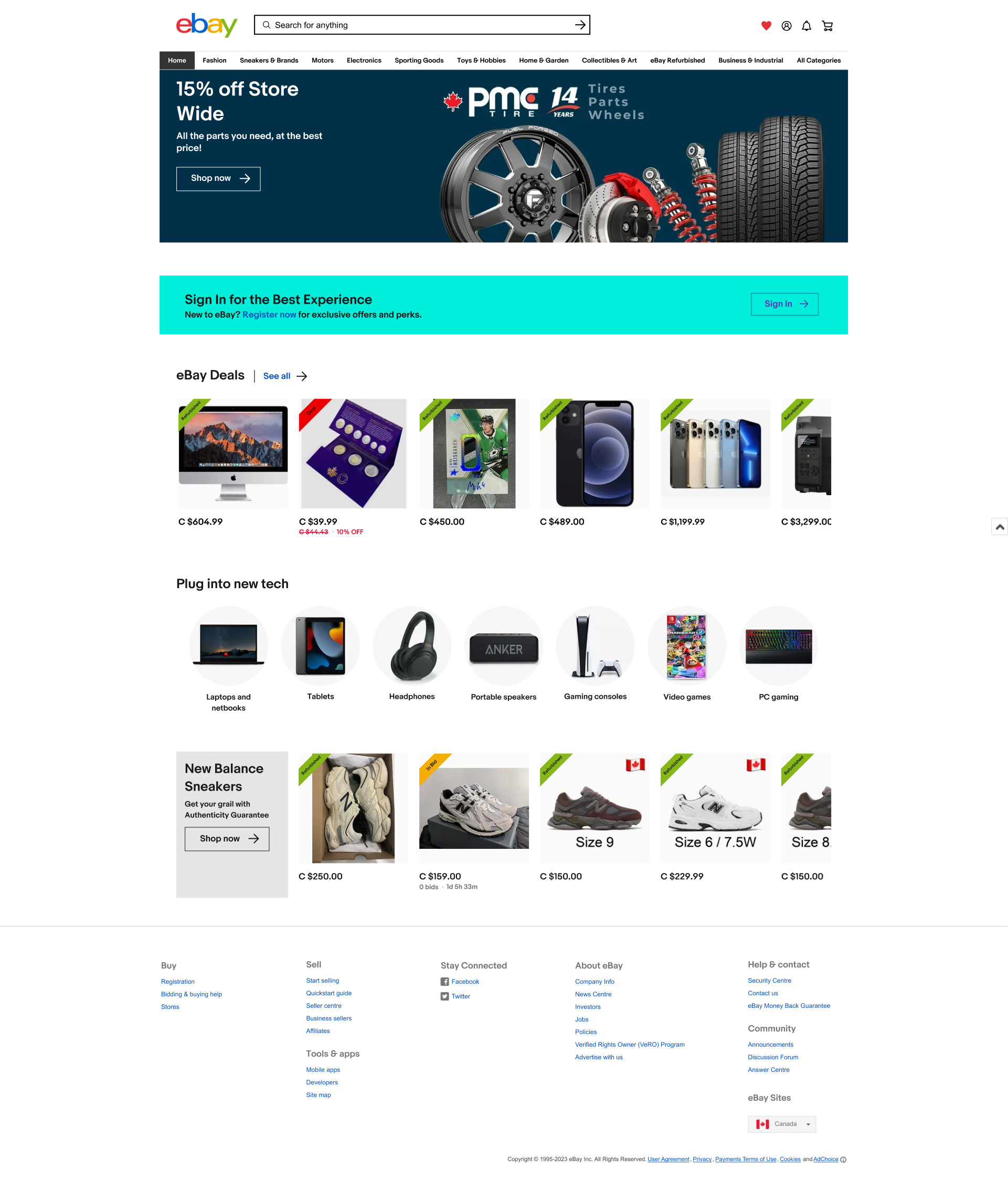
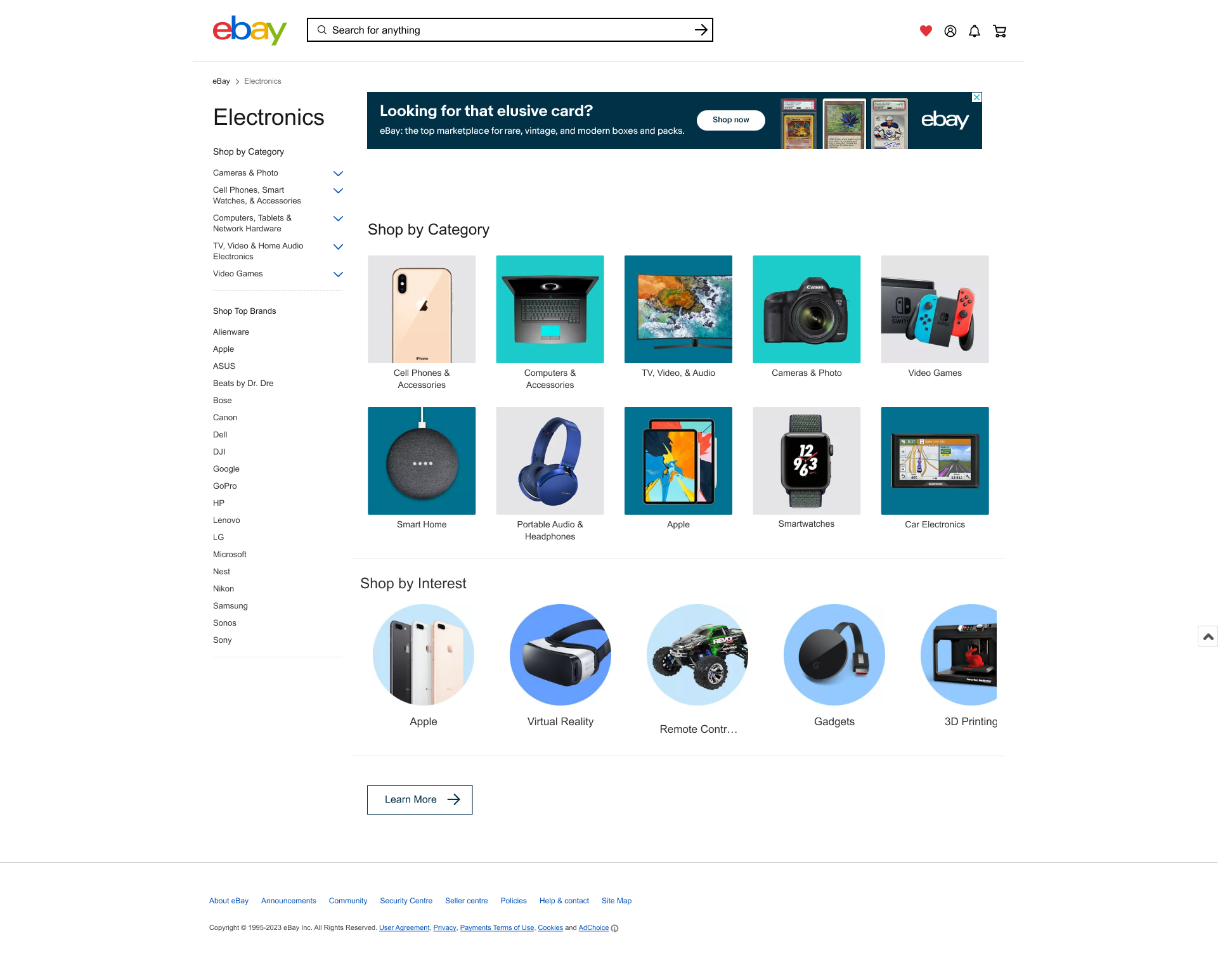
The home page sketch was the most consequential. The core move: collapse the three-bar header (utility nav + search bar + global nav) into a single bar. The utility links such as the account, watchlist, cart, and the notifications became four icons on the right of the search bar. "Shop by Category" moved into the global nav as "All Categories." Search leads, everything else follows.
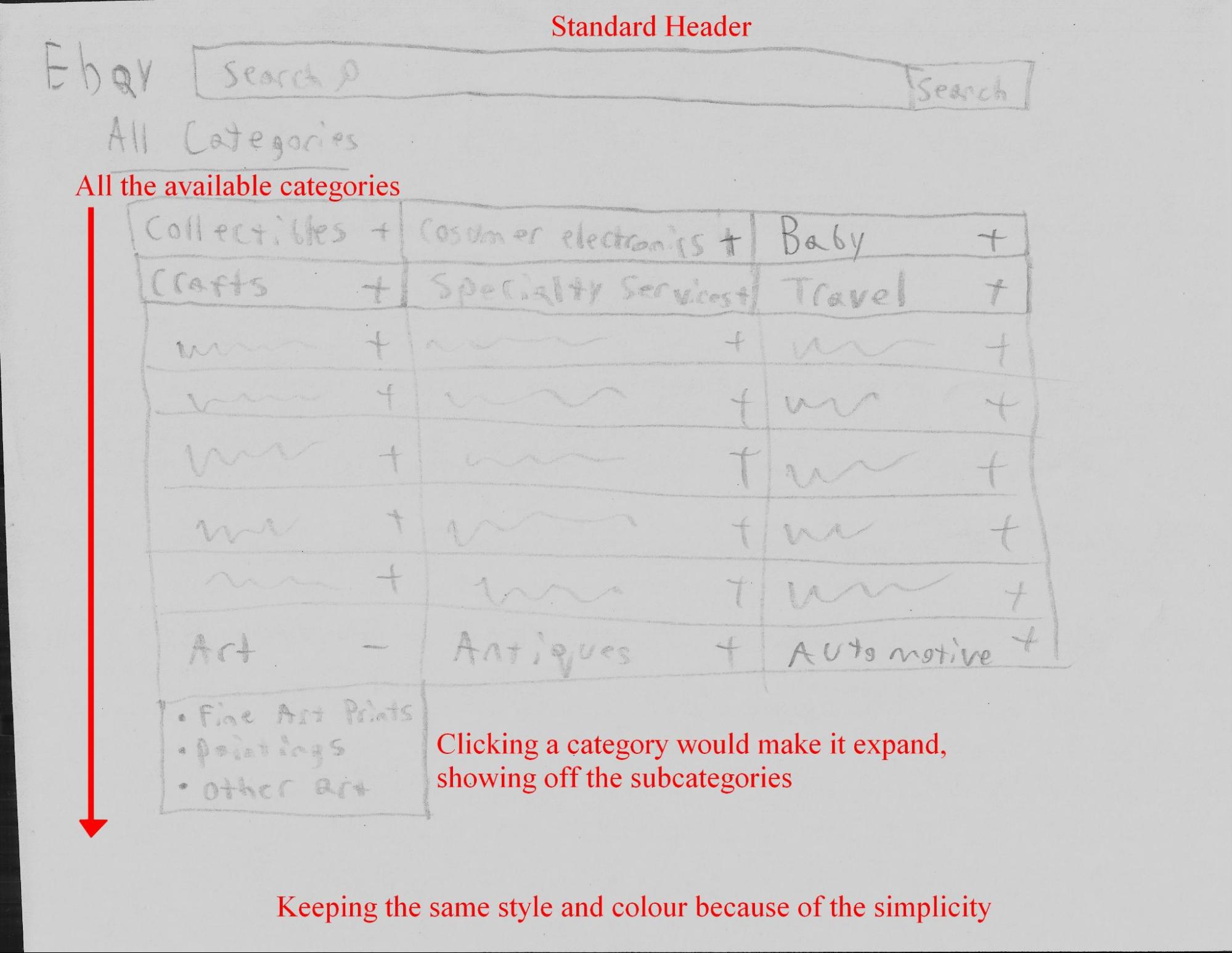
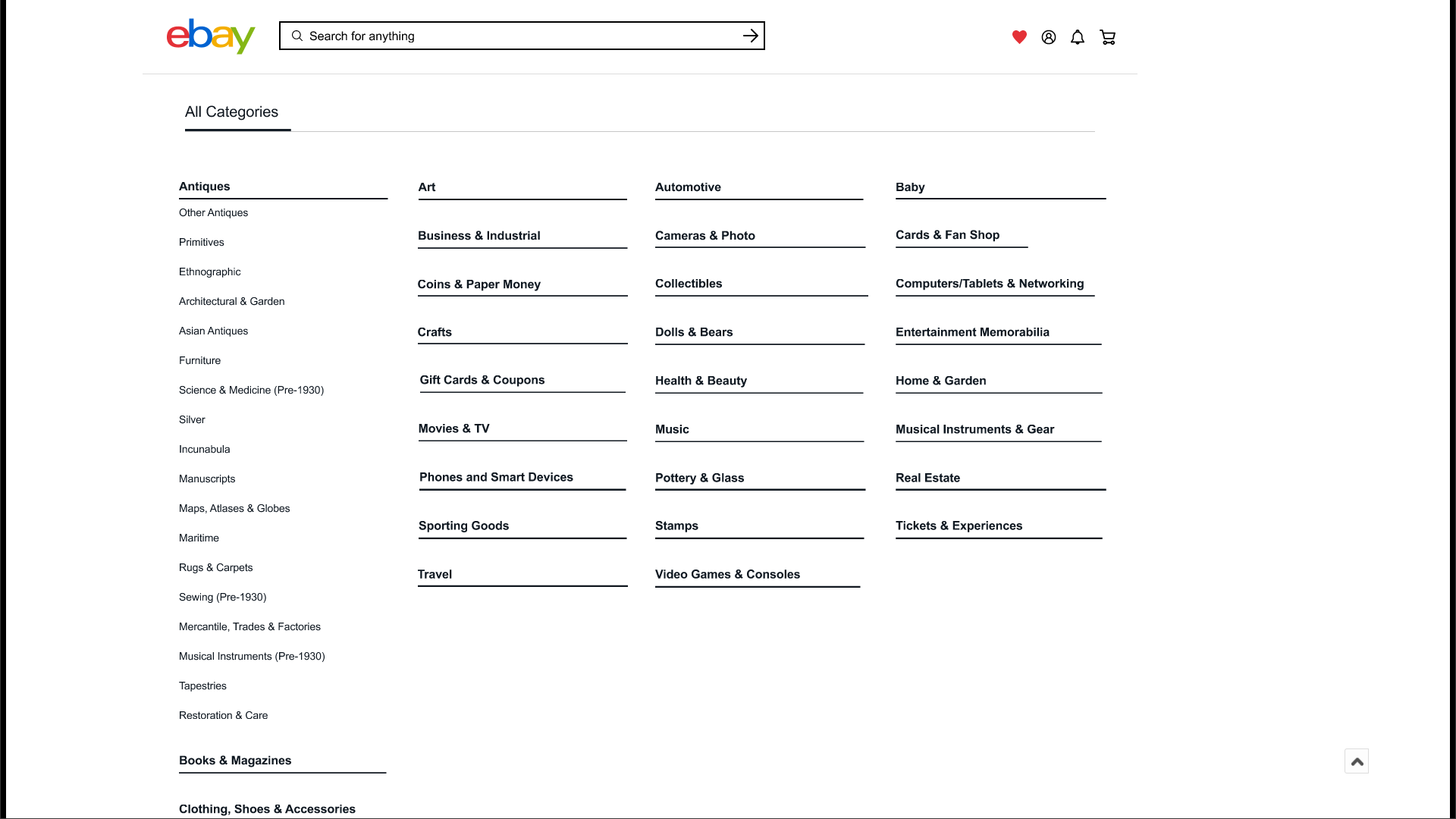
The All Categories sketch solved the information overload problem with one structural change: replace the flat list of every subcategory with collapsible dropdowns. Users see only top-level categories on arrival, drill down on click.
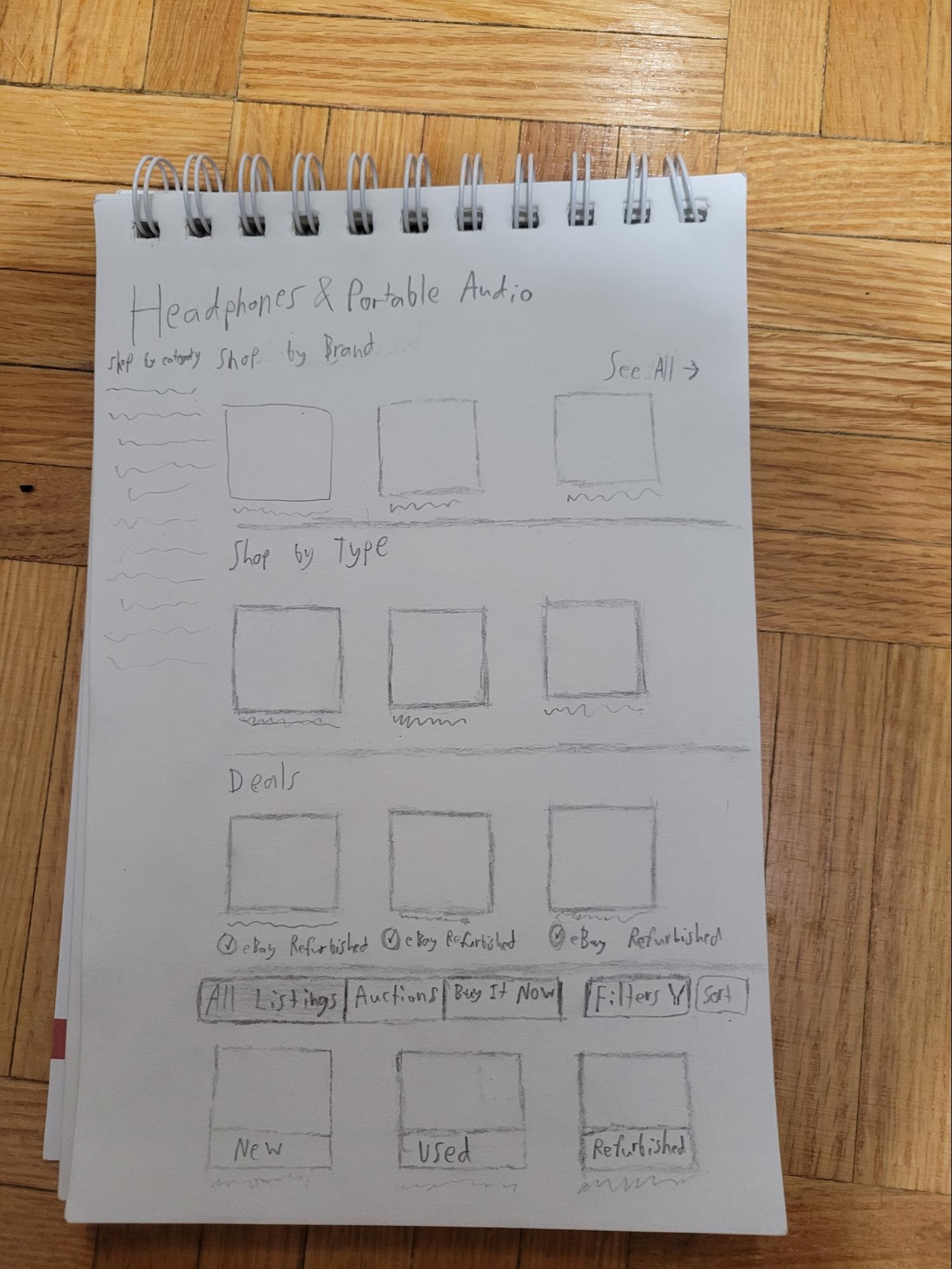
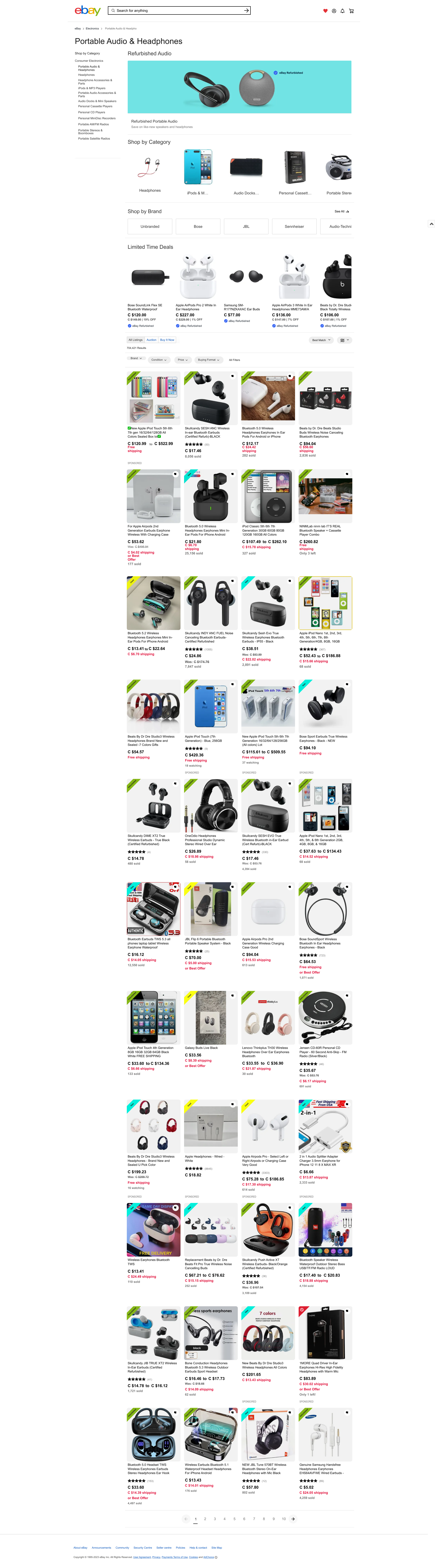
The Headphones & Portable Audio sketch introduced the condition banner idea, which was a visible label on each listing image (New / Used / Refurbished) so buyers don't have to click through just to find out what they're buying.
UI redesign, prototype
With the sketches as the blueprint, the medium-fidelity Figma prototype applied the same decisions at higher resolution. I built the home page screens and oversaw design consistency across the whole set; my teammates owned the remaining page redesigns. The guiding principles were contrast, proximity, and hierarchy.
Home page: proximity and hierarchy
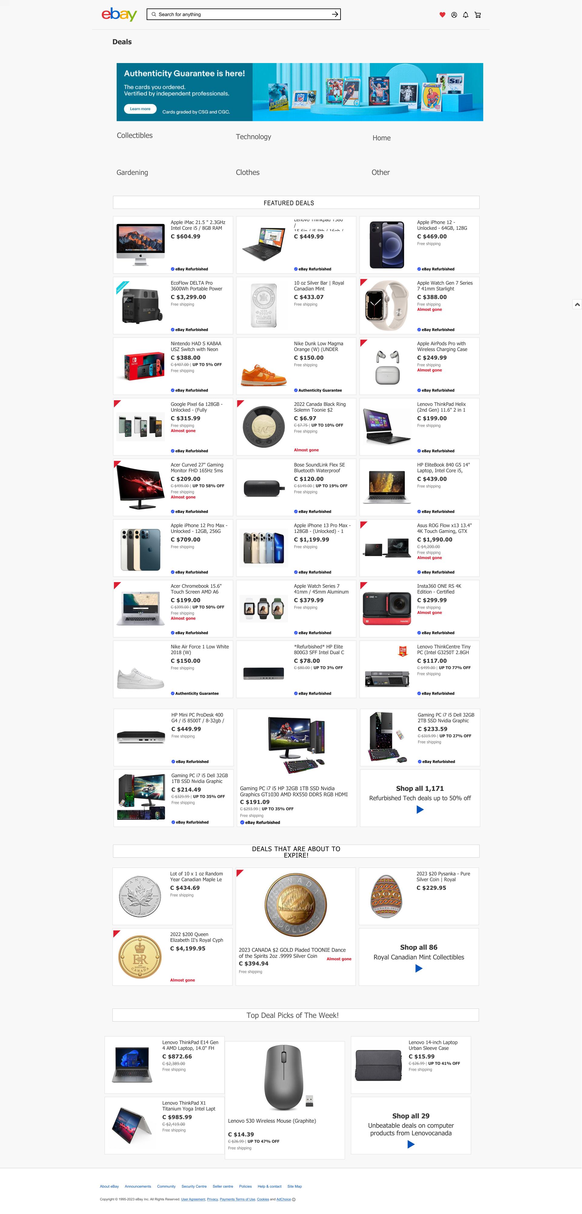
The original header stacked three bars (utility nav, search bar, global nav) into one dense strip that led with sign-in and register before the search field. The utility bar was removed entirely. Its account, watchlist, cart, and notification links were consolidated into icon groups on the right of the search bar. "Shop by Category" moved into the global nav as "All Categories." The result: search leads, browsing follows, account management is present but not competing for attention.
Hyperlinks throughout the page were changed to blue to distinguish them from body text. Condition banners were added to listing card images so buyers can assess condition before clicking through.
All Categories page: reducing information overload
Replaced the full flat list of every subcategory with a dropdown structure: main categories visible by default, subcategories expanding on click. Same information, dramatically less cognitive load on arrival.
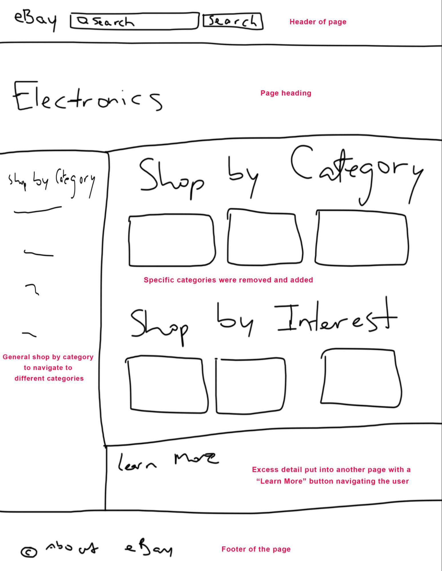
Electronics page: cleaning up the category structure
Replaced inline subcategory descriptions with a "Learn More" button leading to a dedicated info page. Added Smartwatches as a top-level category. Removed Refurbished (kept as a filter, not a category). All subcategory names made consistent.
Headphones & Portable Audio page: contrast and condition clarity
The main issues were readability and condition visibility. Changes: made all black text darker for contrast; changed discount text from grey to red (important to buyers, should be eye-catching); changed "sold/watching" text from red to grey (less important than discount); slightly darkened shipping cost grey; added condition banners (New / Used / Refurbished) as colour-coded labels on listing images so buyers can assess at a glance.
eBay Deals page: structure over promotion
Removed the "Featured" subcategory that pushed promotional content above the actual deals. Organized deals by category in a grid with clear labels. Added a Collectibles section. Added technology as an explicit subcategory so all tech deals appear together.
Decisions and tradeoffs
Buyers over sellers, by necessity. Usability test participants were buyers and first-timers. Seller flows, listing creation, shipping instructions, account management, weren't addressed. That's a real gap. The user who pointed this out during peer review was right. A second research sprint focused on active sellers would be needed before making structural changes that affect their workflows.
Labels over structure. The card sorts confirmed eBay's hierarchy (home → category → subcategory) was sound. The friction was entirely in label ambiguity and duplication. That shaped everything: targeted renames and removals, not a full reorganization.
Architecture doesn't fully solve discoverability. Task 5 in the tree test proved this. Even with a restructured IA, users went to Electronics for tech deals because that's the logical first move. The fix was additive, a Tech Deals link in the Electronics dropdown, not architectural.
Scope-matched fidelity. Five weeks, small participant pools. The prototype is medium-fidelity with documented before-and-after comparisons, not a complete high-fidelity redesign. The goal was defensible, evidence-backed changes. Every IA decision traces back to a specific card sort finding.
ReflectionWhat I learned.
Running five separate card sorts instead of one general one was the most important methodological decision the team made. Each page had its own user mental model problem. The Headphones card sort surfaced a misclassification that was entirely invisible from the home page study, the "iFlash adapter" sitting in a vague "Replacement Parts & Tools" category that every single participant rejected in favor of "Portable Audio Accessories." That finding wouldn't have come from a high-level IA audit alone.
The usability tests were valuable for surfacing the emotional experience, what it feels like to miss the Sell label, to get misled by auction pricing, to navigate into the wrong subcategory and have to backtrack. But they didn't produce the specific, actionable IA fixes that the card sorts did. Both methods were necessary. Neither was sufficient alone.
The tree test was the best signal of what actually mattered. A 100% direct success rate on the Sneakers task told me the rename worked better than any design critique would. A 25% failure rate on the Deals task told me the fix the team had made, restructuring the Deals section, wasn't enough. The users' mental model of where to find tech deals was grounded in "Electronics," not "eBay Deals." Adding the Tech Deals shortcut in the Electronics dropdown was the right call, but I only knew to make it because the test data said so.
What I'd do differently: run at least one usability test on the prototype itself. The before-and-after comparisons show that changes were made, they don't show whether those changes made the task faster, clearer, or less confusing for a real user. That gap is the thing I'd close in a second iteration.