A safety-critical system still running on a numeric keypad and four blinking lights.
Traditional building security systems still ship with a wall-mounted numeric keypad, a single-row seven-segment LCD, and four LED status lights. We pulled one apart in preliminary research and found the interaction model badly dated. Sensor status is shown as a number on the LCD that maps to a sensor only via an external memo or the user's long-term memory, raising cognitive load. The same number scheme doubles as the error-code system, compounding the confusion. Feedback is four lights and a string of digits that, in practice, tell the user almost nothing.
The stakes are not cosmetic. We argued the system is safety-critical: per FBI reporting, homes without security systems are up to 300% more likely to be burglarized, and over a million property crimes were recorded in 2021. A guide by Sampson on false burglar alarms notes that user error, such as incorrect passcode entry under a disarm timer, is a primary cause of false alarms, which also drains police resources. A poorly designed security console is not a minor usability problem. It can mean a missed break-in or a wasted police dispatch.
The brief: digitally transform this legacy system into a modern touchscreen console that fixes the feedback gap, lowers cognitive load, and survives the high-pressure moments the product exists for.
ContextA two-person build, then a solo stress test.
This was a paired project with Matthew Ganotisi. I owned the problem framing and the justification for treating the system as safety-critical, designed the camera section of the dashboard and the individual camera pages, the add-wireless-camera flow, logs, and camera settings, and ran the second participant's evaluation. Matthew led the domain research, the keypad and chimes settings pages, and the questionnaire calculations. We co-designed the dashboard, the settings page, and the interactive prototype wiring.
The work ran across two cycles. The first built the digital console, evaluated it with two peers using standardized questionnaires, and iterated on their feedback. The second was a solo deep-dive that put the disarm task under a measured stress simulation and pushed the redesign further. The console you see is the same product evolving across both.
Our plan was deliberate: inventory the legacy system's features and flow, port them to a digital interface while fixing the feedback and cognitive-load problems, borrow proven patterns from modern digital security products, then prototype low-fidelity, then high-fidelity and interactive against the improved workflow.
The PrototypeOne dashboard for arming, cameras, and emergencies.
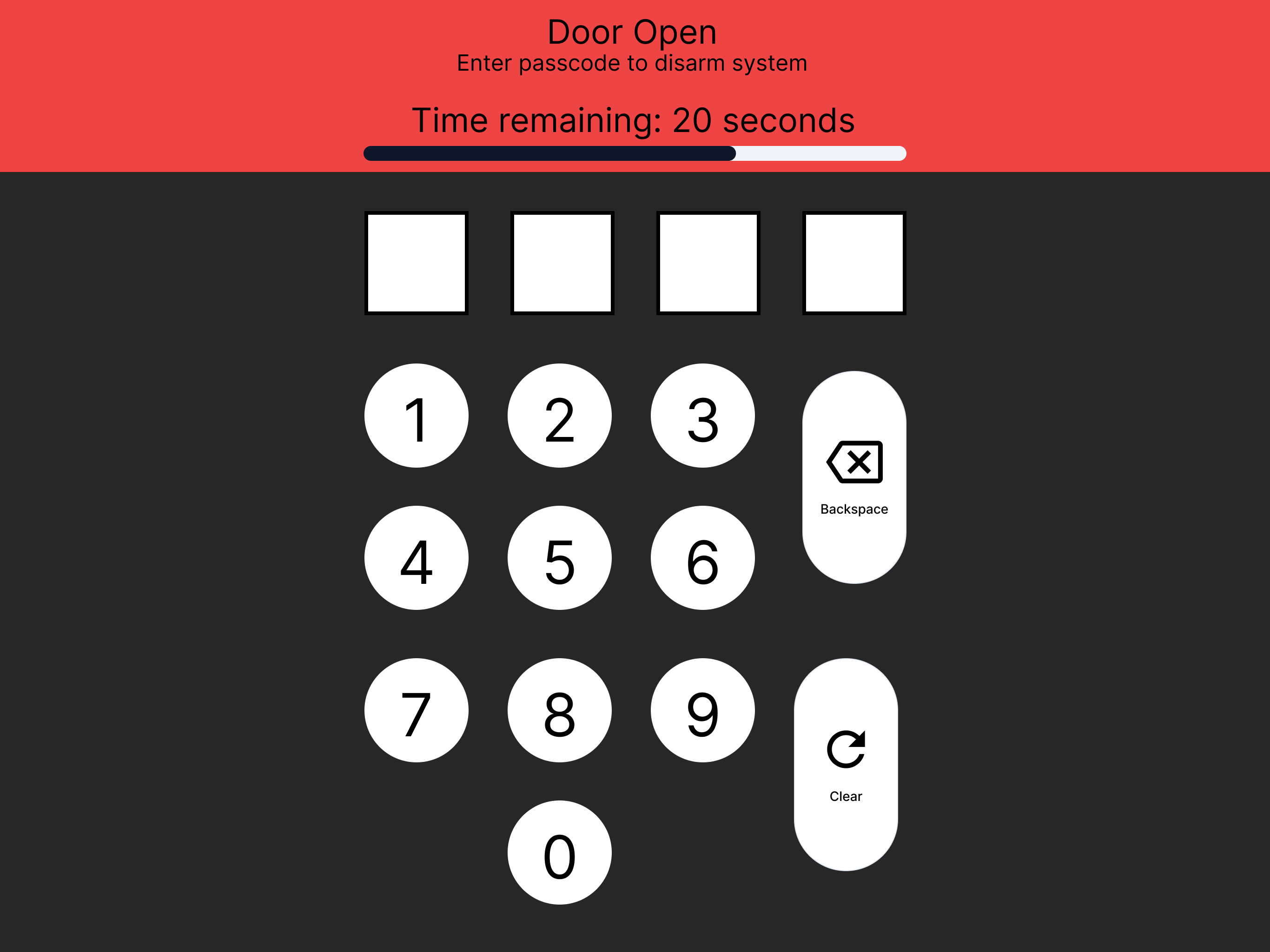
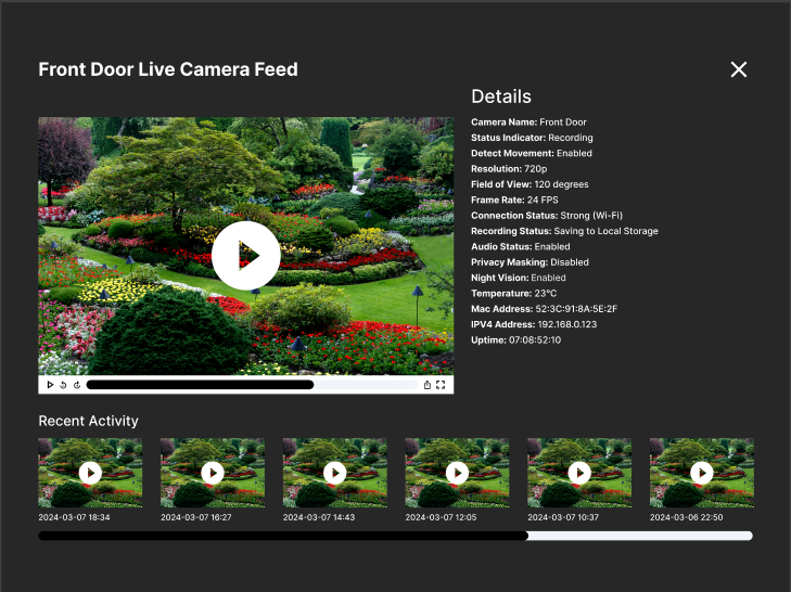
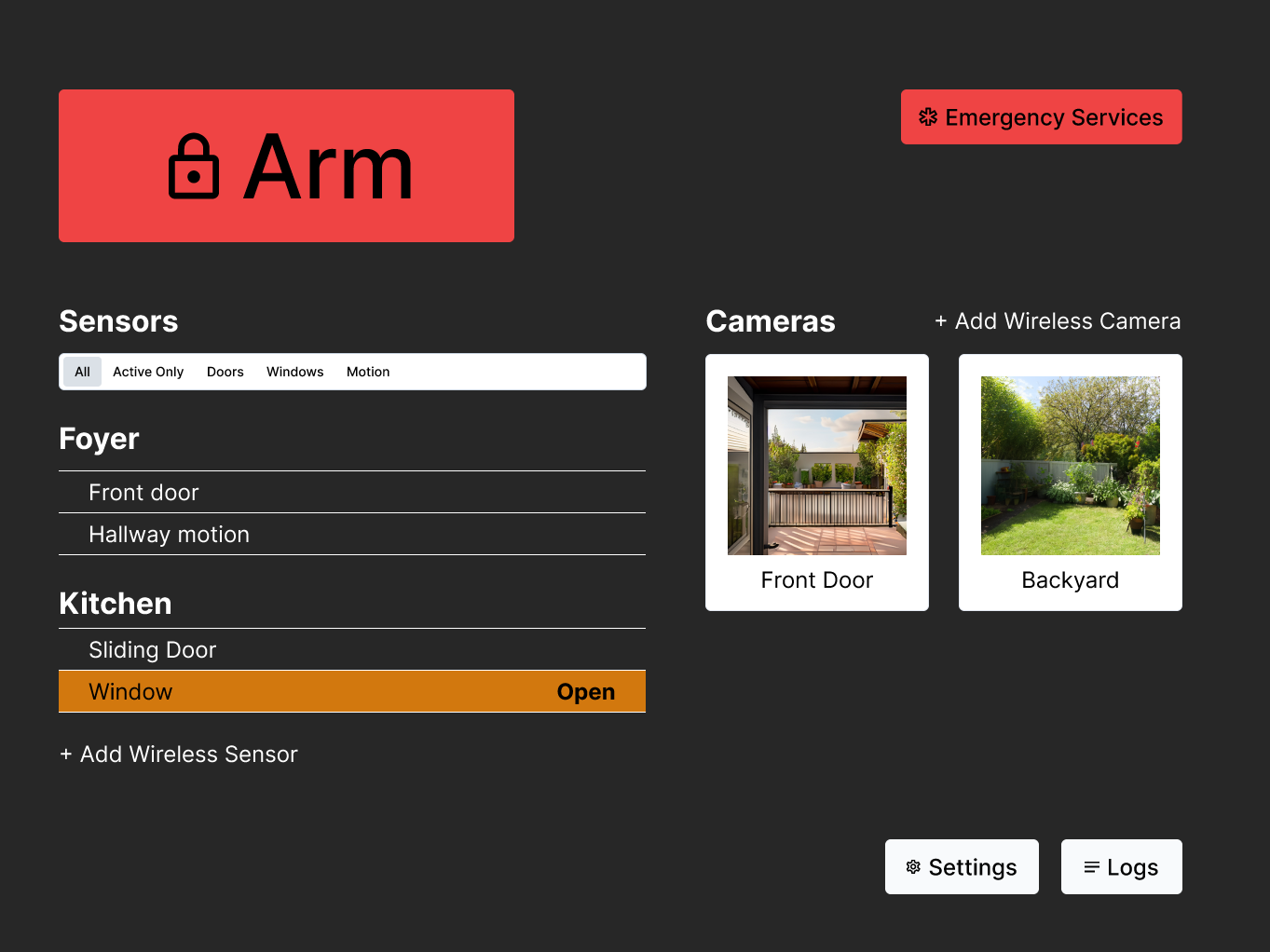
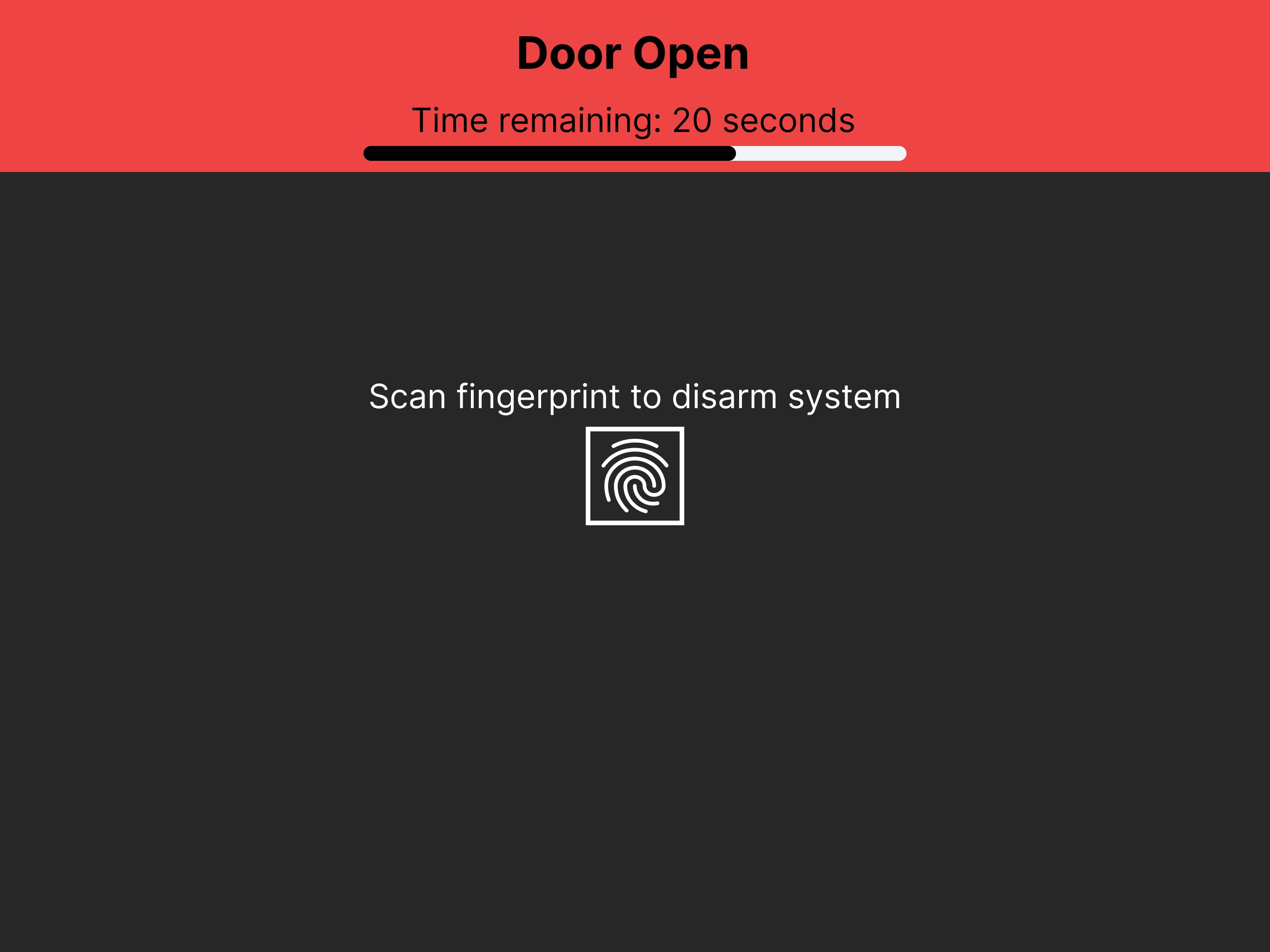
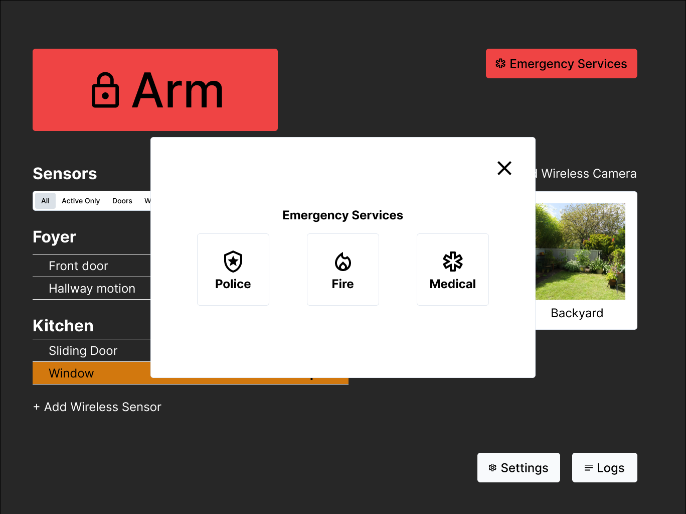
The high-fidelity Figma prototype centers on a single dark dashboard: sensors grouped by room with live open/closed state, a camera section with named feeds, a prominent Arm control, and an Emergency Services entry point. Disarming uses a four-digit passcode (1234) entered against a visible countdown timer, replacing the legacy LCD with explicit, readable feedback at every step.
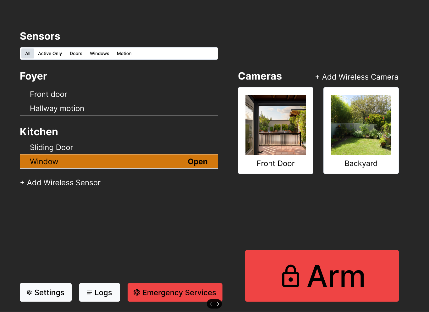
The camera section was the part I owned. Each feed opens to a live view with full camera details, and an activity strip of recent clips runs along the bottom for quick review.
EvaluationTwo peers, PSSUQ and NASA TLX.
We recruited two classmates to evaluate the prototype and gave each the PSSUQ and NASA TLX post-task questionnaires. Two tasks: (1) run into the house and disarm the open-door system within 20 seconds, and (2) review a suspicious clip from the front-door camera and decide whether to call emergency services.
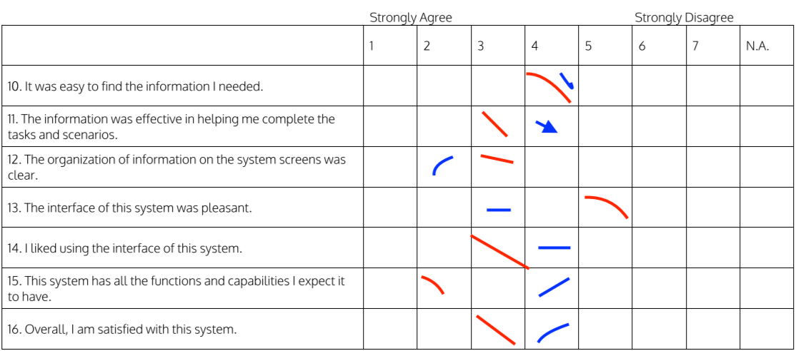
PSSUQ
Both participants landed close together, around 3.9 overall on the 7-point scale, satisfied with interface quality and confident they could recover from errors. The weak spot was consistent: questions 3 and 4, which measure how quickly and comfortably the system can be used. Usefulness and speed were the soft underbelly.
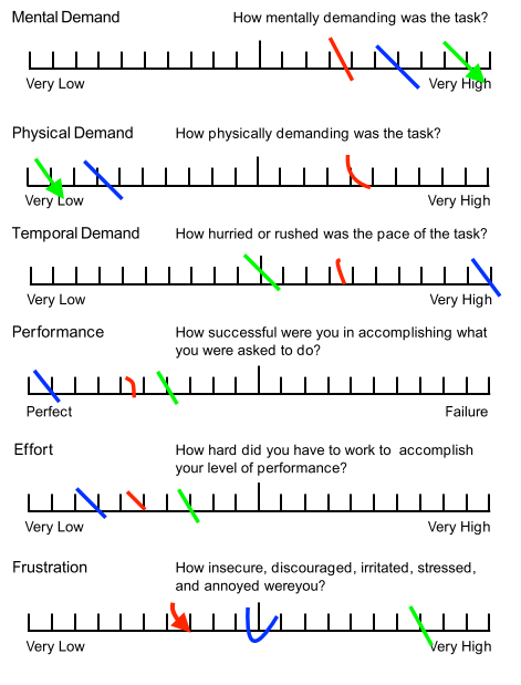
NASA TLX
The weighted TLX told the same story from a different angle. Across both participants, temporal demand scored highest, with mental demand and frustration close behind. Both completed the tasks successfully and without much difficulty, but they felt the time pressure throughout, exactly the dimension that matters in a real emergency.
The two instruments converged: the core experience was sound, but the system was too slow and too demanding under time pressure. Every iteration target followed from that.
IterationFive changes from real user feedback.
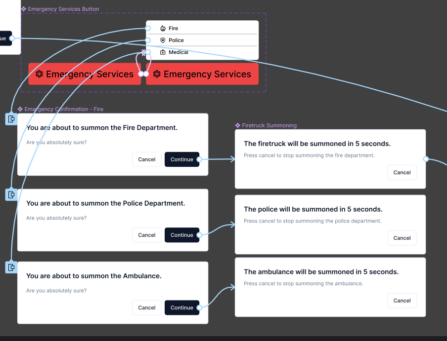
Cut the redundant 5-second confirmation
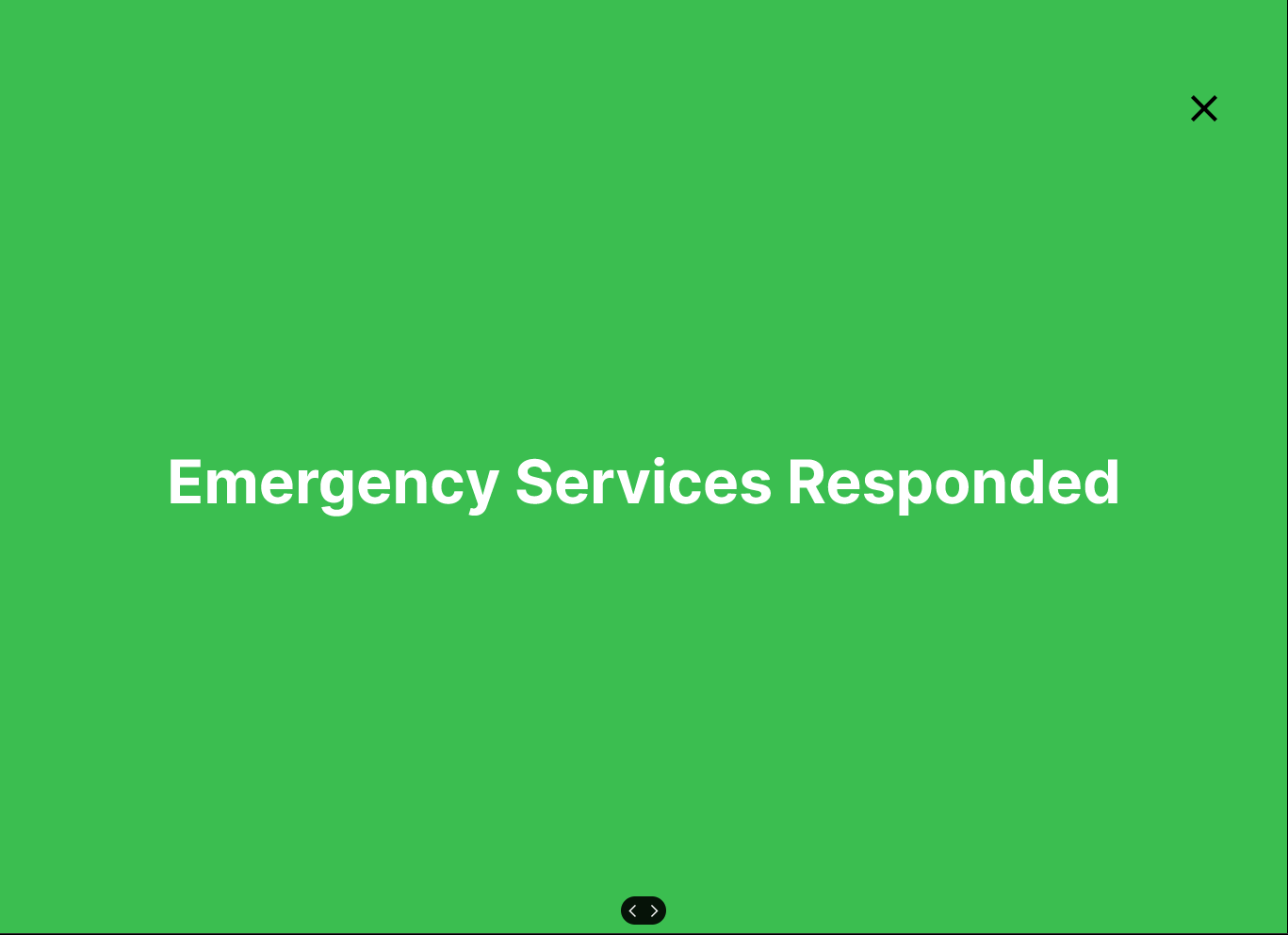
The original emergency flow asked the user to confirm ("you are about to summon the Police Department, Continue?") and then showed a second 5-second "will be summoned, press cancel to stop" overlay. Both testers cancelled a dispatch by accident because they did not realize they had to wait through that overlay. In a safety-critical flow every second counts, and a redundant secondary confirmation is a hazard, not a safeguard. We removed the 5-second overlay so Continue summons help immediately.
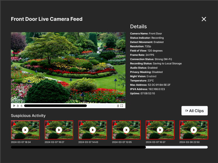
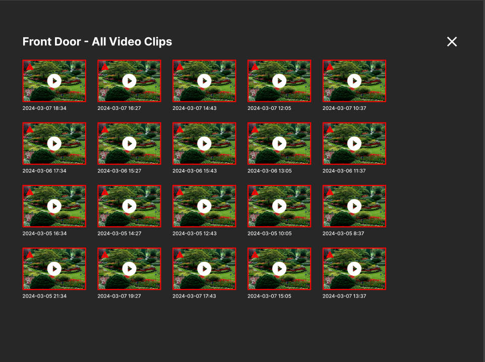
Redesign Recent Activity into Suspicious Activity
Participant two never opened the flagged clip. He scanned the live feed, went back, and called the police anyway, which told us the interface was not surfacing what mattered. We replaced the neutral "Recent Activity" strip with a "Suspicious Activity" strip that outlines flagged clips in red and adds a warning symbol to pull the eye to genuine security risks.
Add a dedicated all-clips page
Pulling routine footage out of the main view created the need for somewhere to keep it. A dedicated per-camera page holds the full clip history so the dashboard stays focused on threats without losing access to everything else.
Fix the live-feed and playback ambiguity
Participant one tried to play back clips and could not, and a play button on the live feed made users think the live stream was a recording. We added a "Watching Video" state so clip playback reads as a deliberate action, and removed the play button from the live feed so it simply autoplays.

Add passcode reset
Participant two flagged that there was no way to change a passcode if a user forgot or wanted to update it. We added a passcode-change feature with a verification step for forgotten codes, available only while the system is disarmed for security.
Going DeeperMeasuring the stress the disarm task actually produces.
Testing kept pointing at time pressure, so the second cycle put the disarm task under a psychophysiological stress simulation rather than assuming the load. I staged a chase home: a friend played the pursuer, my phone stood in for the door keypad, my laptop for the wall console, and the task was to get inside and disarm before a 30-second timer auto-dialed emergency services.
Heart rate, counted manually over 10 seconds and multiplied by six:
- Resting baseline: 78 bpm after sitting still for three minutes.
- Post-simulation: 132 bpm, taken immediately after the run.
A 54 bpm jump confirms the task carries real arousal, not neutral-lab load. I was candid about the rig: we re-ran the chase to space the pursuer correctly, and a trackpad is not a wall touchscreen, both of which can shift the reading. A solo NASA TLX afterward again put temporal demand on top, consistent with the two-participant evaluation.
That measurement justified three more aggressive moves on the same console.
Promote the critical controls
The eye lands at the top first. I moved Arm/Disarm and Emergency Services to the top of the dashboard so the two crisis controls are found instantly instead of hunted for beneath sensors and cameras.
Replace the passcode with biometrics
The disarm passcode forced recall under panic, the exact condition where memory fails (participant one mis-entered it three times while visibly rushing). Swapping it for a fingerprint scan removes the recall step and shortens disarm to a single gesture against the clock.
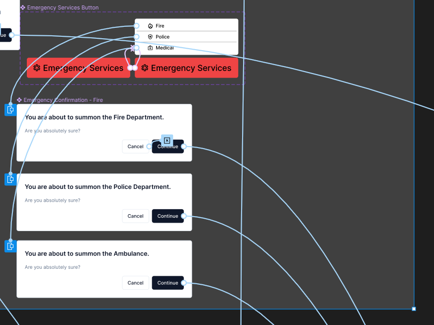
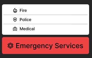
Enlarge the emergency picker and remove the last confirmation
The small Fire/Police/Medical dropdown was easy to mis-tap with shaking hands, so I replaced it with a focused pop-up card carrying three large buttons. Building on the 5-second-overlay fix from cycle one, I also removed the remaining confirmation dialog entirely, taking the emergency call from three actions to two, with a full-screen "Emergency Services Responded" state for unambiguous feedback.
What a shipped version should track.
I closed with an analytics program for a live product: five tracking categories crossed with three segments.
Track: user engagement (session duration, screens per session, retention), navigation paths (which screens are visited and in what order, to expose mismatched mental models like hunting for camera settings in the wrong place), error rate (where and when errors cluster), system performance (load times and latency), and qualitative feedback (surveys and ratings).
Segment by: age group, geographic location, and language. Each segment changes the read. Older users may make more errors on small targets, areas with unstable power may show error spikes from resets, and non-native speakers on an English-only system may be slower and more error-prone, which is the signal that tells you where translation and larger targets actually pay off.
The throughline: navigation data turns a guess about confusion into evidence. If users repeatedly bounce from the camera page to settings looking for camera settings, that is a logged path you can fix, not a hunch.
ReflectionWhat the project taught me.
The lesson that stuck: measure before you redesign. Two standardized questionnaires and a stress simulation all pointed at the same enemy, time, and that consensus kept the work aimed at speed instead of polish that would not survive a real emergency. The PSSUQ flagged slow usability, the NASA TLX named temporal demand, and the 78-to-132 bpm jump proved the disarm task genuinely spikes the body.
Watching real users was where the sharpest fixes came from. The accidental dispatch cancellations, the ignored flagged clip, the live-feed play-button confusion, none of those were visible in design review. They surfaced the moment two people actually used the thing, and they drove five concrete changes.
I was also honest about the limits, and that honesty is part of the work. Two participants is a small sample, a trackpad is not a wall console, and manual pulse counting is not HRV. The redesign is well-reasoned and grounded in measurement, but the proof still lives in a larger validation pass: more participants across ages, languages, and tech literacy, real touch hardware, and a head-to-head test of the old console against the new under the same load that produced 132 bpm.