Crunchyroll sold the subscription before it showed the anime. Then it shipped the same fix.
Crunchyroll has the catalog, the simulcasts, and the community. And yet anime fans who could subscribe don't — they stay on piracy sites, share accounts, or churn soon after signing up. This project set out to answer why.
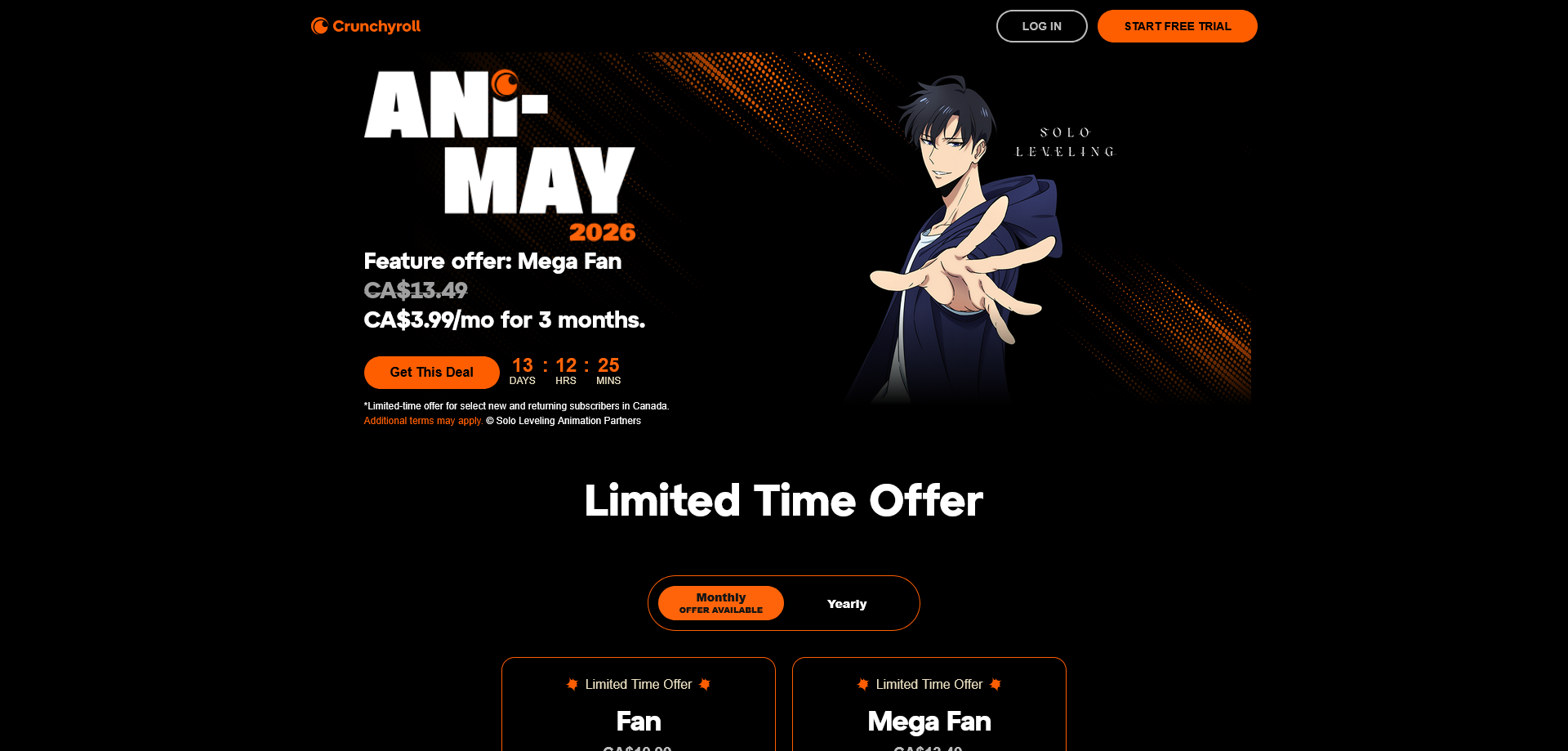
The answer wasn't the content. It was the pitch. When I audited the site in May 2026, the first thing a visitor saw was a pricing table with a countdown timer — before a single trailer or series. The homepage was built for someone who had already decided to subscribe. Most visitors hadn't.
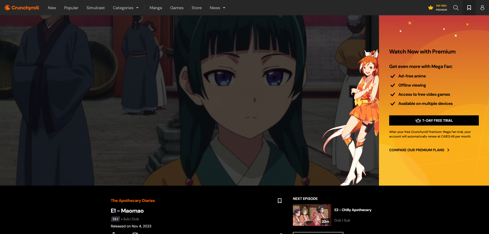
The first thing a visitor saw was a price, not a show
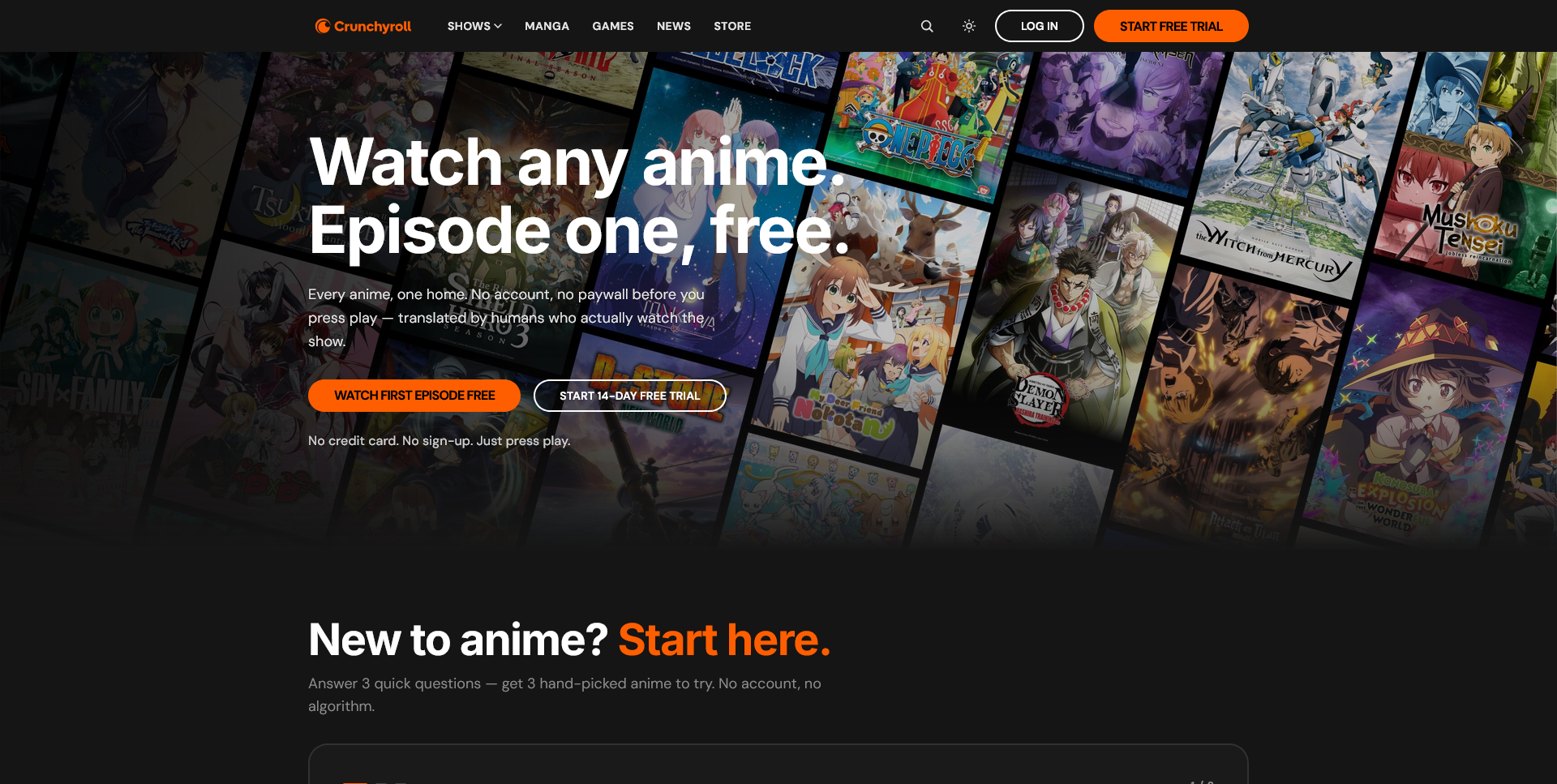
I redesigned the four conversion touchpoints — homepage, paywall, onboarding, post-purchase — around one principle borrowed from Gabe Newell: build value before you pitch it. Introduce the subscription only once the visitor has something to lose by not paying.
Objectives, and what I'd measure if it shippedSuccess criteria
What I set out to do: understand why anime-interested users who could subscribe don't; pin down the specific UX failures driving friction, distrust, or disengagement rather than "the homepage feels off"; and redesign the touchpoints so people feel value before they're asked to pay.
What I'd instrument: homepage-to-content engagement rate, trial-to-paid conversion, whether a new subscriber plays anything within 24 hours, and homepage bounce rate.
Eight interviews. Not one person defended the homepage.
Five personas, five reasons not to pay
Every design direction targets one or two of these specifically, not "users" in the abstract.
| Persona | Why they don't pay | What it drove in the redesign |
|---|---|---|
| Piracy Pragmatist | A frictionless free habit that's hard to beat on convenience, let alone price | Free first episode, no account required |
| Lapsed Subscriber | Paid before, drifted away, remembers a better version of the platform | Post-purchase welcome screen |
| Value Analyst | Runs the actual math and isn't convinced | Pricing moved below four content proof points |
| Anime Curious | Hasn't committed to the medium yet, and lacks the vocabulary for it | "Start Here" flow that never asks about genre |
| Passive Browser | Arrives goal-directed, just wants to search for one title | Search — still unbuilt, and the study's sharpest miss |
Eight interviews, collapsed into six root problems
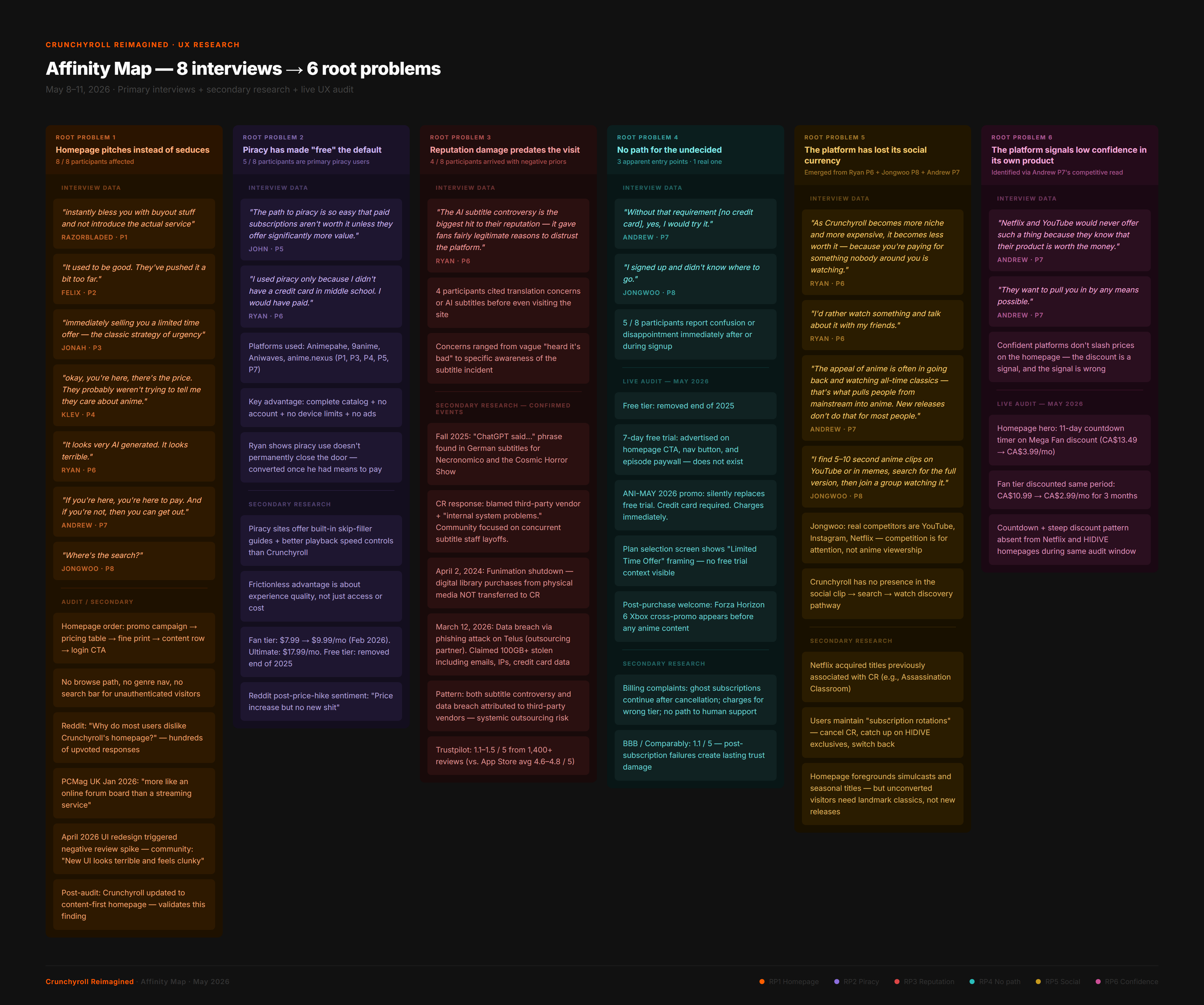
The six problems everything else traced back to
- A homepage that pitches instead of seduces. Every participant reacted negatively to the pricing-first layout. Without exception.
- Piracy has made "free" the default. Five of eight use piracy primarily — not because they can't pay, but because zero friction has become the baseline.
- Reputation damage that predates the visit. Four arrived with concrete concerns about AI-assisted subtitles and layoffs before they'd even seen the site.
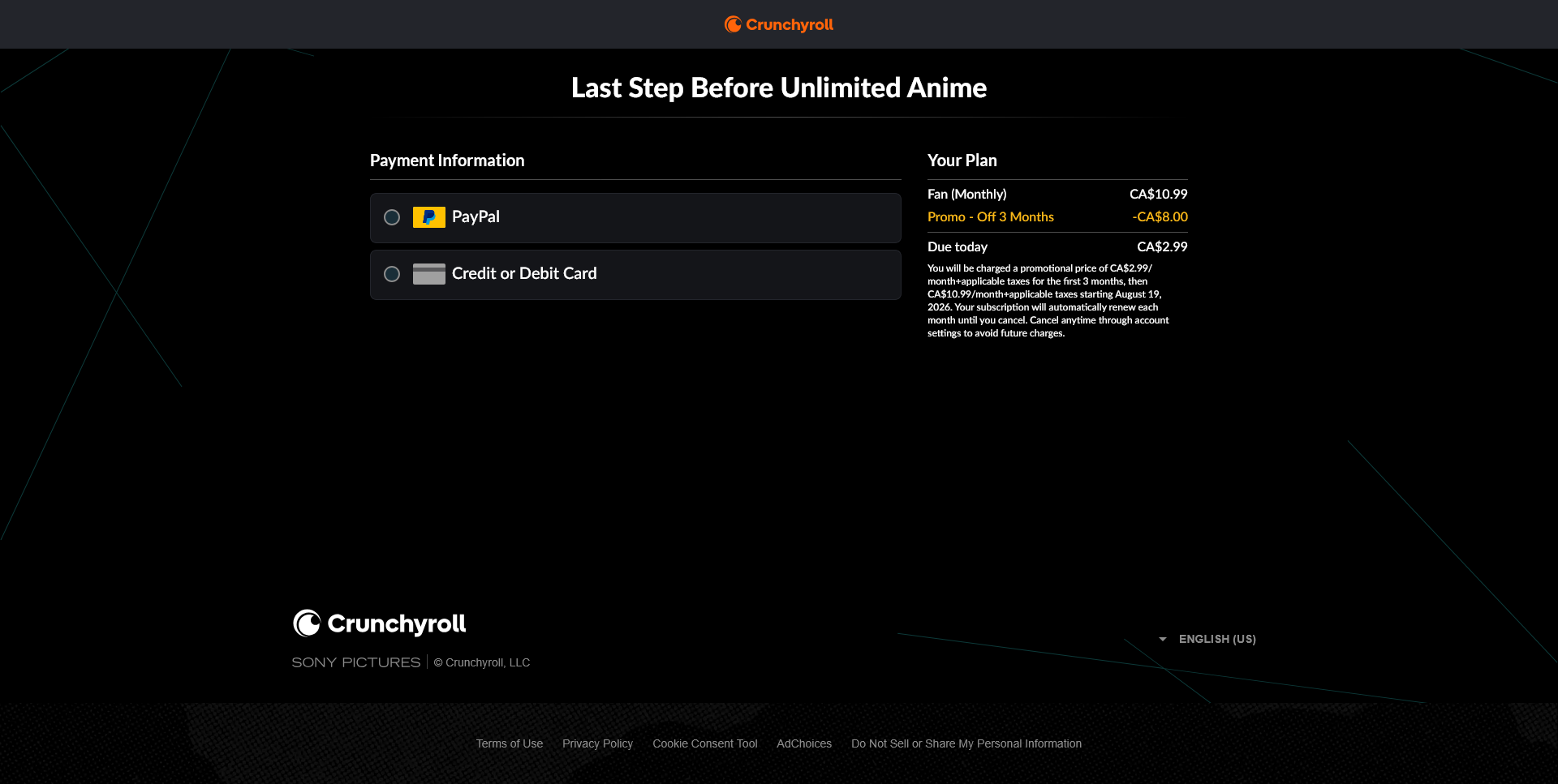
- No path for the undecided. One entry point: pay now, with a card, upfront. The "START FREE TRIAL" button never led to a trial — it led to an immediate CA$2.99 charge.
- The platform has lost its social currency. An increasingly niche catalog means paying for content and watching it alone, with nobody in your circle to talk to about it.
- It signals low confidence in its own product. A countdown timer and a deep discount read as desperation. One participant: competitors "would never offer such a thing because they know their product is worth the money."
Three of four competitors led with content. Crunchyroll didn't.
Even HIDIVE — a platform its own users call worse-designed than Crunchyroll — got this one right.
| Platform | What's above the fold | Leads with |
|---|---|---|
| Netflix | Full-bleed featured title, then rows | Content |
| HIDIVE | Simulcast hero and catalog | Content |
| Piracy site | Latest episodes grid | Content |
| Crunchyroll | Pricing comparison table with a countdown timer | Price |
Secondary research: how the reputation damage is documentedApp Store · Reddit · Trustpilot · PCMag
Secondary research validated every primary finding at scale. One detail proved critical: in Fall 2025, subtitles for Necronomico and the Cosmic Horror Show contained the phrase "ChatGPT said..." in the German track — direct evidence of AI use in localization, and the documented source of the reputation damage participants described.
That matters because it moves RP3 out of the realm of vibes. Participants weren't repeating a rumour; they were reacting to a specific, verifiable incident. A trust problem with a traceable cause is a trust problem a design can actually answer.
Process"If you're here, you're here to pay. And if you're not, then you can get out."
- Andrew, Interview P7
How I got from problem to solution.
Every problem became a How-Might-We before any screen got drawn
"How might we redesign the first 10 seconds of the homepage so a visitor encounters content, not pricing, and feels curious enough to stay?" — from RP1
"How might we eliminate the gap between what 'Start Free Trial' promises and what the signup flow actually delivers?" — from RP4
Six problems produced more HMWs than a solo three-week build could ship. Four survived.
Built as a working prototype, not a Figma comp
React + Vite, Tailwind, Framer Motion, on Vercel. Same principle as the redesign, applied to the case study itself: demonstrate the value before asking anyone to believe in it.
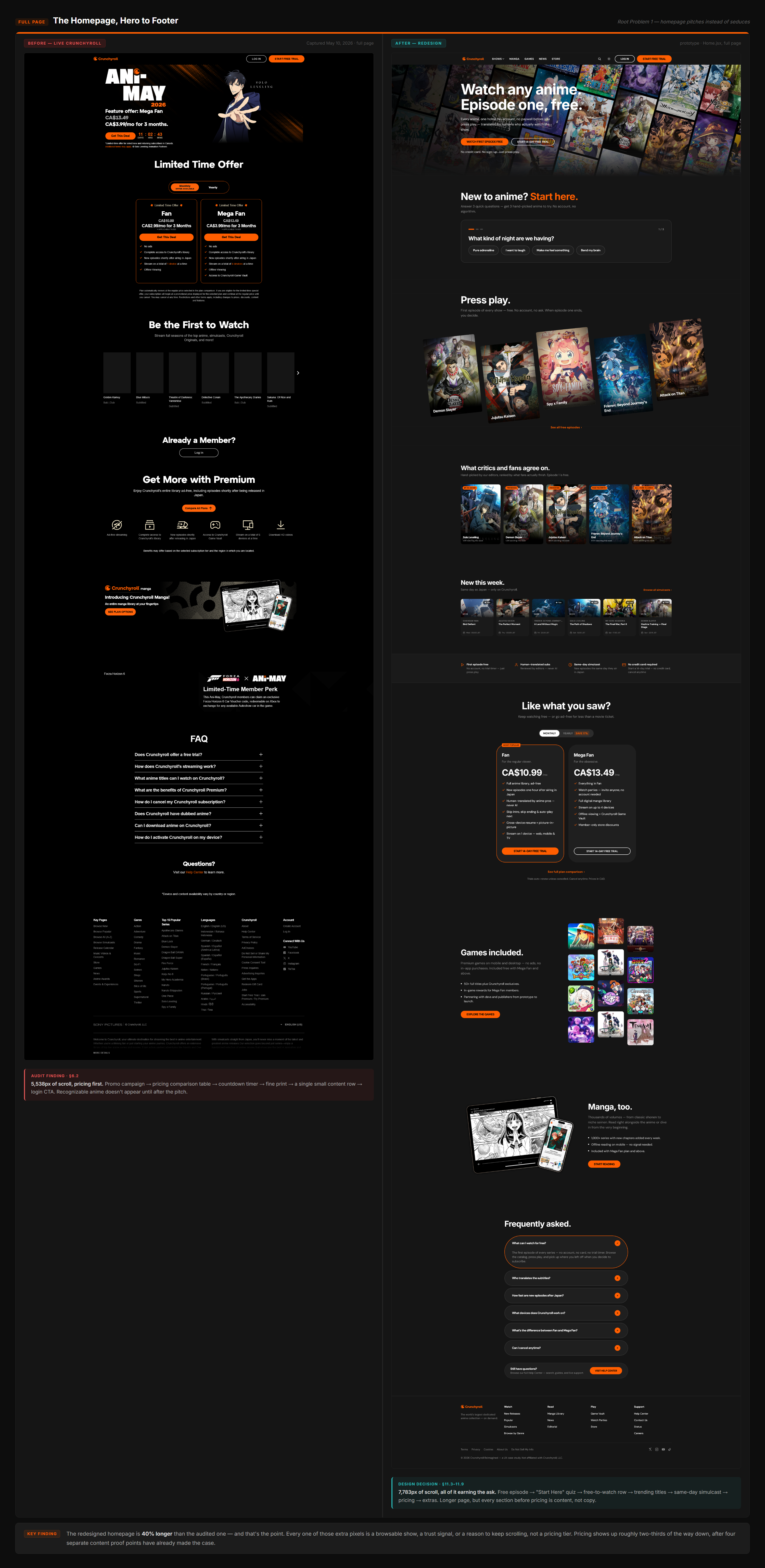
The redesign runs 40% longer — every extra pixel earns the ask
Four decisions
Lead with content, not pricing tiers.Homepage hero · RP1
The single most consequential call in the build. Replacing the pricing table with a full-bleed featured series freed every downstream screen from doing conversion work. The paywalls, plans page and post-purchase screen all got more honest once the homepage stopped pretending the visitor had already decided to pay.
Move the paywall to after Episode 1, not the front door.End-of-episode gate · RP4
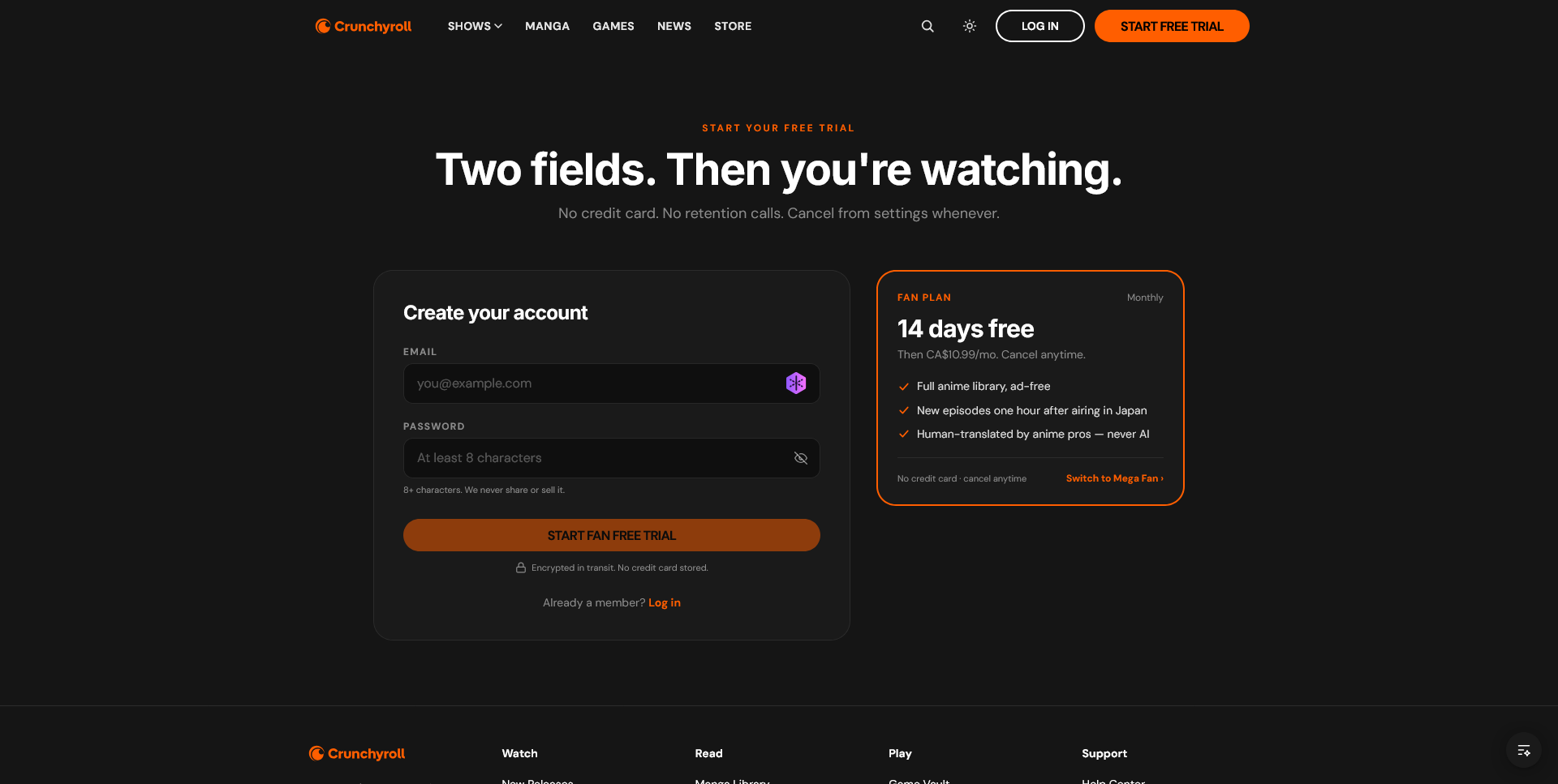
The gate fires when the episode ends. The prompt reads "Episode 2 is waiting" — continuity, not purchase. The trial says "no credit card required," which was Andrew's stated condition for trying the platform at all.
Turn the sharpest interview finding into a UI component.Trust Strip · RP3
A band below the hero carrying four proof points: first episode free with no account, human-translated subtitles reviewed by editors, same-day simulcast, and a 14-day no-card trial. Each pillar answers a specific root problem, and it sits above the fold so it counters the reputation damage before the visitor acts on it.
This is the throughline of the project — a qualitative finding becoming a shippable pattern rather than a slide.
Ask three questions, and never one about genre.Start Here flow · RP4
A skippable flow asking mood, time available, and familiarity, returning two or three picks with human-written blurbs instead of algorithmic tags. It avoids "what genre do you like" on purpose: the research showed newcomers don't have that vocabulary yet.
The paywall moved from the front door to the end of Episode 1
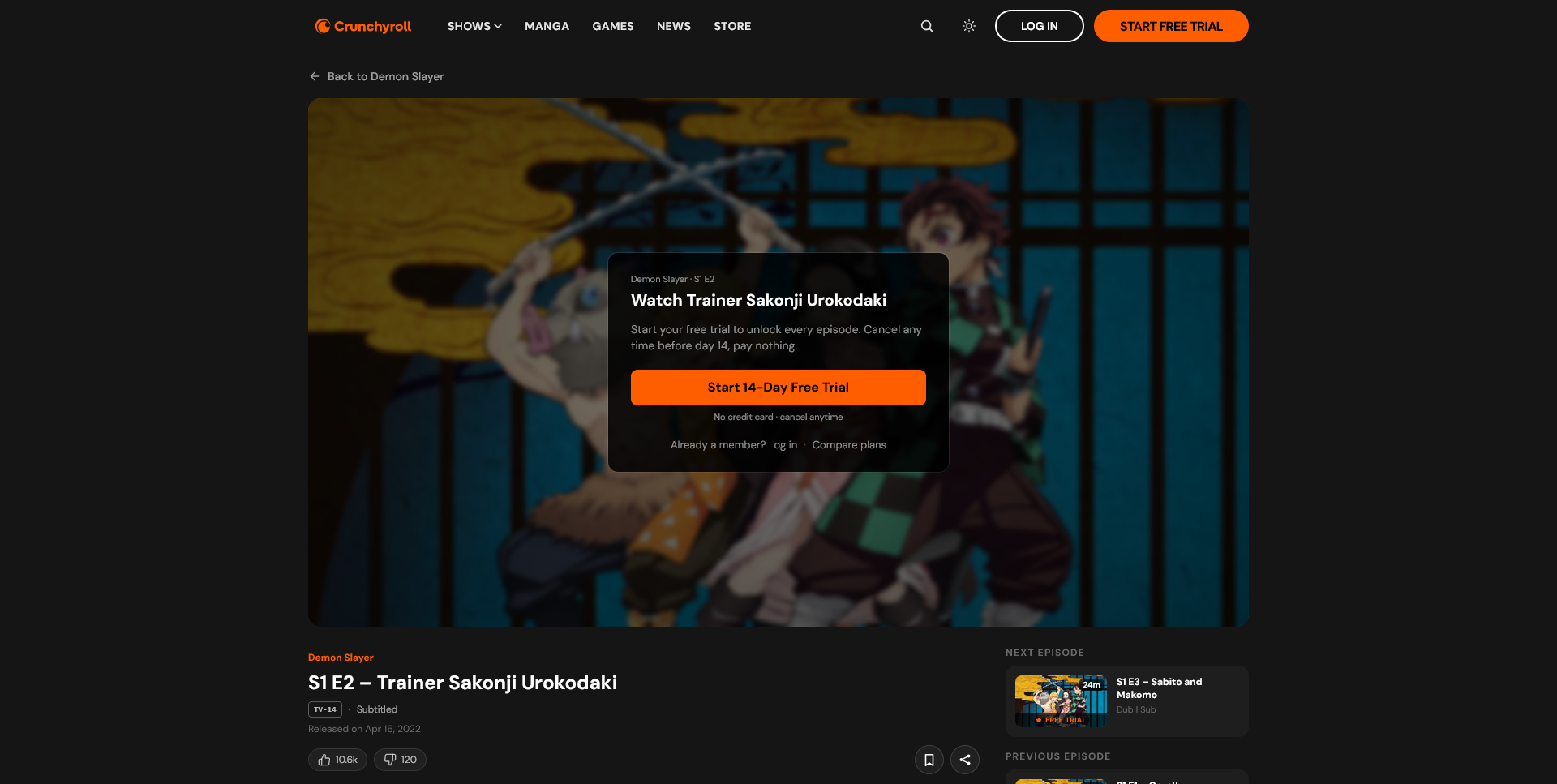
The same problem, one step downstream
Every CTA said "Start Free Trial." Checkout charged CA$2.99 immediately. Andrew's interview answer became the fix — "no credit card" isn't a feature bullet in the redesign, it's the headline.
The promise the checkout page finally keeps
The visual system and how the prototype is builtColour, type, routing
Two brand colours carry the whole UI. Orange (#ff5e00) for every primary action, and teal (#2abdbb) reserved only for trust signals so it never competes with a conversion CTA. Display type targets Crunchyroll's own licensed typeface, falling back to Inter since that font isn't publicly available; body copy runs in DM Sans throughout. Every button uses the same 48px pill radius across all six pages — small consistency choices like this are what keep a prototype from reading as a collection of disconnected screens.
The prototype covers the full conversion loop: content-first homepage → browse row → series detail → free episode playback → end-of-episode gate → plans page → sign-up → post-purchase welcome. Routing is client-side via React Router; series data is static and mocked, so the prototype is reproducible without any infrastructure.
Live prototype → · Repository →
ValidationTesting it on real people.
The two biggest wins matched the two biggest problems
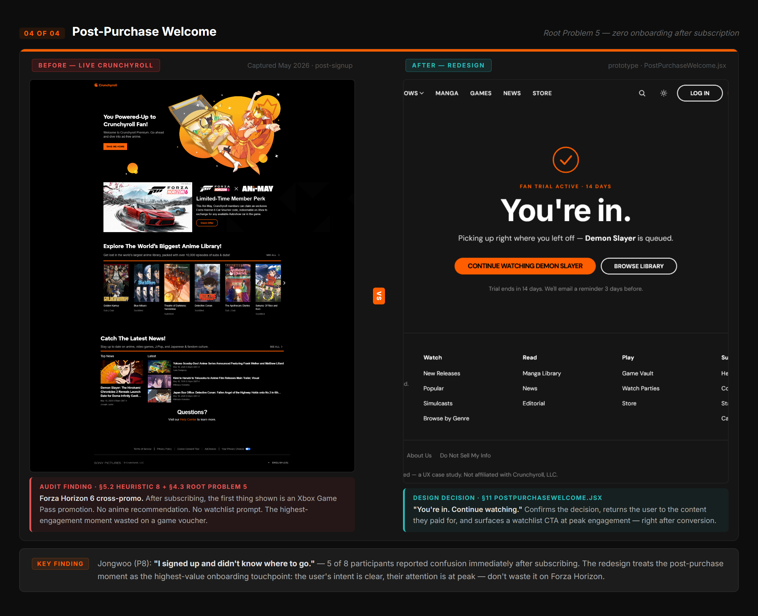
The welcome screen scored highest in the study.
4.42/5 on clarity of what to do next. Nine of twelve named it the screen most changed from the original — the same screen the audit found most broken.
The homepage stopped reading as an advert.
Eight of twelve flagged it as noticeably different. One returning participant: the original is "just a big ad for the paid service, there's no anime," while the prototype "makes it feel more like the platform is really a place to watch shows rather than steal your money every month."
What a new subscriber saw first: a car game
It also caught three things I had missed
"One sitting" returned a 1,100-episode series.
The Start Here engine scored on genre and familiarity but never filtered by runtime — so it recommended One Piece. Exactly the failure that undercuts the trust the feature exists to repair.
Both mobile testers hit bugs I never saw.
Broken nav links and a player that fast-forwarded the whole episode. I had done the 375px sweep myself and called it done — you only click the things you already know work.
Search surfaced for the third time.
Four participants asked for it unprompted, independently reproducing a finding from the original interviews. Three separate research events, no fix between them.
One more pattern: copy taken from interviews beat copy written from intentTrust Strip vs Trending Row
The Trust Strip's "no credit card, cancel anytime" was lifted almost verbatim from Andrew's stated condition for trying the platform, and tested cleanly.
The Trending Row's header — "What critics and fans agree on" — was written from what the section was trying to do rather than how anyone actually talks about a popular show. Multiple participants flagged it as vague. Same principle the whole project is built on, applied inconsistently inside my own prototype.
No single screen was broken. The aggregate was.
No single screen was catastrophic. The aggregate was. The audited experience read as adversarial only when you walked the whole flow — which is why the fix had to be a principle, not a redesign of one page.
Commit to the thesis earlier. Once the homepage led with content, everything else fell out of it: the paywalls became contextual, the trust strip made sense, the plans page stopped shouting. The principle governed. I just took too long to trust it.
Test on real devices, with real strangers. I ran the mobile sweep myself and called it done. Two outside participants found the bugs in minutes, because I only click the things I already know work.
If I ran this again: filter the recommendation logic by runtime before any further testing, run a dedicated mobile session, and build the search bar instead of flagging it a fourth time.
Get in touch → if you want to talk through the research or the build.