High schoolers can't get career guidance fast enough — and counsellors can't keep up.
Meet Emily: a Grade 12 student in Ontario, applying to universities, sitting between parents with a fixed career plan for her and her own genuine uncertainty about what she actually wants. Her school counsellor is supposed to help, but with one counsellor serving 396 students on average — and as many as 826 in the most under-resourced schools (Collie, 2019) — Emily gets a 15-minute appointment if she's lucky. She leaves the office no closer to a decision.
The product had to thread three constraints up front. It needed to serve the student without trying to replace the human relationship she actually needed. It needed to give counsellors a way to extend their reach (and earn alongside their day jobs) instead of feeling displaced by software. And it had to ship as a mobile-first low-fidelity Figma prototype — because phones are where Emily and her peers actually live, and they're the most globally accessible device for the students with the worst counsellor access.
ResearchKey insights.
I started with stakeholder problem-mapping before touching a single screen. The persona work surfaced Emily's emotional reality — ambition, parental pressure, isolation — but the two demographic-level studies reframed the problem entirely. This wasn't a student information problem. It was a counsellor supply problem. Students weren't short on Google results — they were short on a trusted adult with time. That insight shaped every later decision, including the choice to build counsellor scheduling into the core experience instead of treating it as a "nice-to-have" tab.
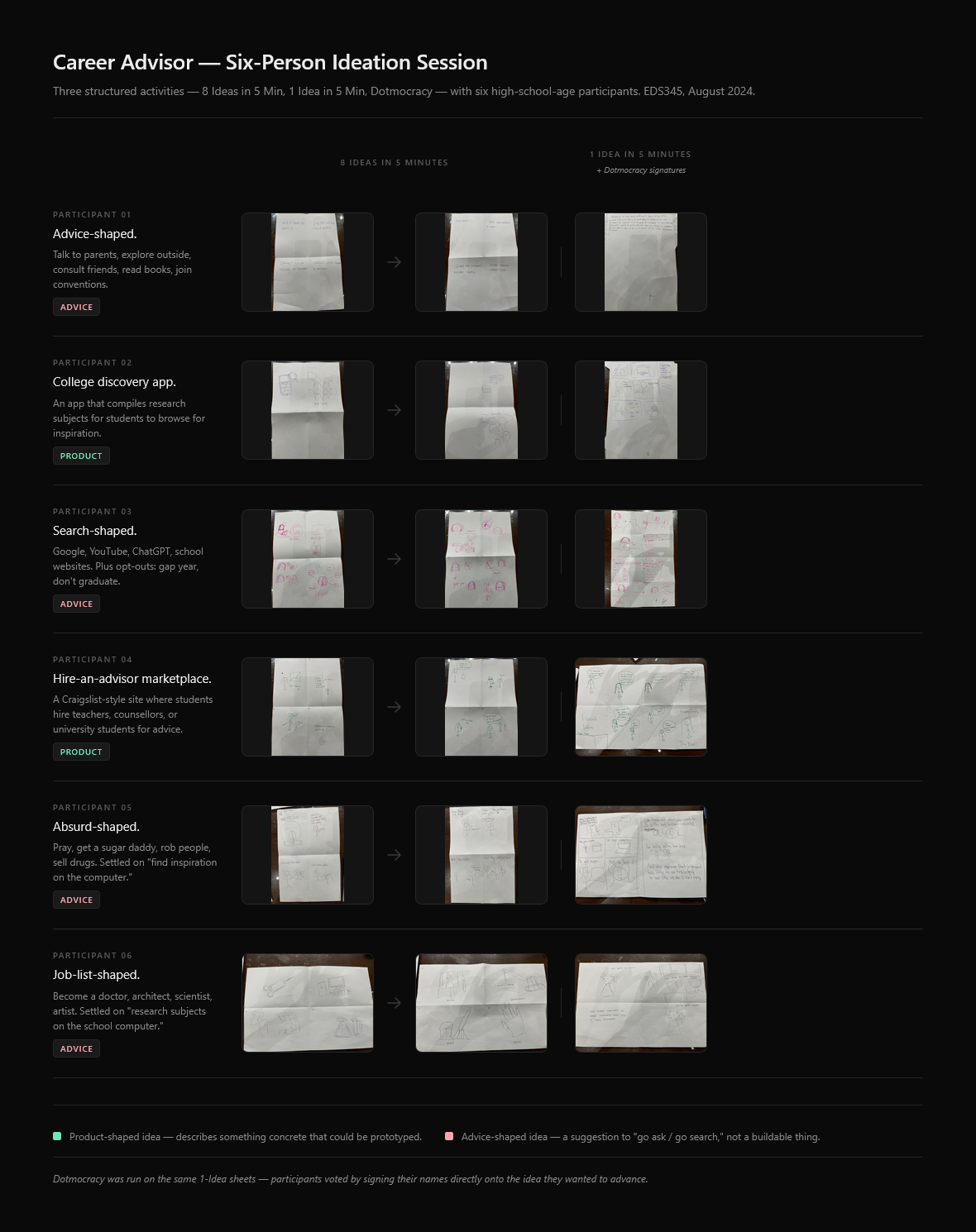
To pressure-test the direction, I ran a six-person ideation session with three structured activities: "8 Ideas in 5 Minutes," "1 Idea in 5 Minutes," and Dotmocracy. The session almost failed in a useful way. Most participants generated vague advice-shaped ideas — "Go to YouTube," "Search the internet," "Ask Siri" — instead of tangible product concepts. That misfire was the most valuable thing the research produced: it told me the problem statement I'd written was leaking the solution space. Framed as "Emily needs help finding her career," brains default to "give her advice." When I reframed around the counsellor bottleneck, the ideation produced product-shaped ideas: a hire-a-counsellor marketplace, an exploration app with quizzes and articles, a scheduling layer.
Process"84% of high school students in Toronto and Vancouver feel ill-prepared for university." — Chorostil & Ranger, 2021
Design exploration.
I sketched a competitive landscape against CareerExplorer.com and LinkedIn Career Explorer first. CareerExplorer leaned heavily on assessment quizzes and static resource libraries — strong on diagnostics, thin on human follow-up. LinkedIn's tool matched users to jobs based on overlapping skills — useful for someone mid-career, useless for a 17-year-old who hasn't built any skills yet. The whitespace was clear: combine self-directed exploration (quizzes, articles, browseable careers) with on-demand counsellor access, on a mobile surface, priced so a global pool of counsellors could plug in and earn alongside their day jobs.
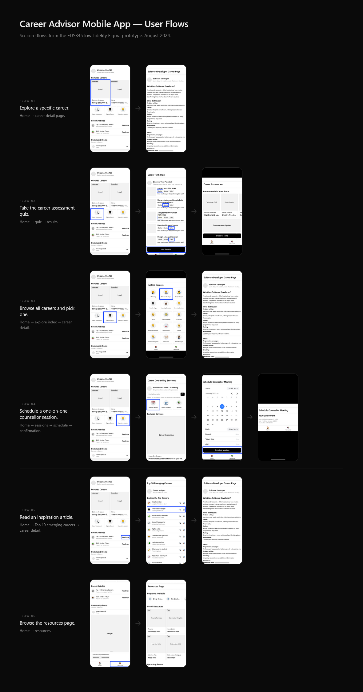
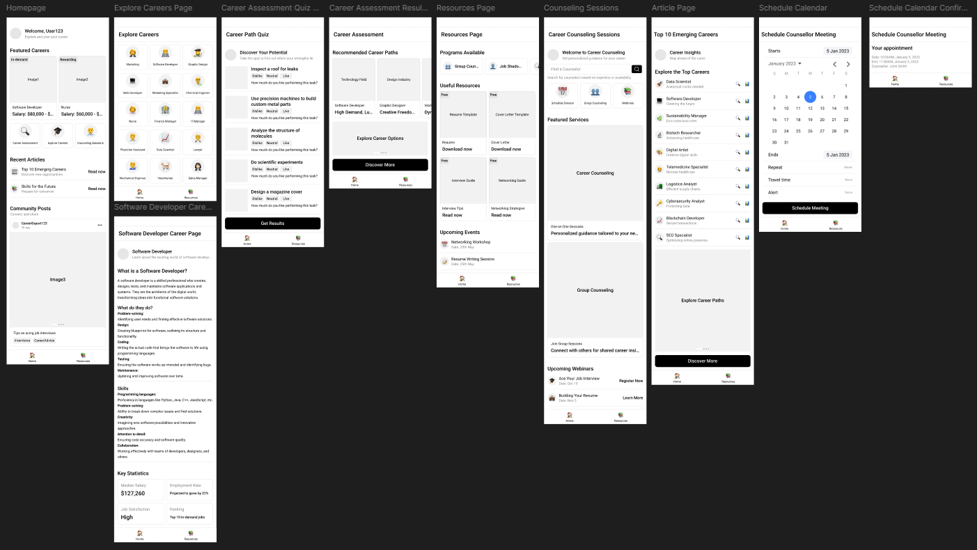
From there I built a low-fidelity Figma prototype around six use cases: a personalised home feed, a career assessment quiz, an explore-all-careers index, individual career deep-dives (e.g. Software Developer), a counsellor scheduling flow with calendar confirmation, an articles surface (Top 10 Emerging Careers), and a resources page. Keeping fidelity intentionally low — grayscale blocks, system fonts, placeholder content — meant I could iterate on flow and information architecture without anyone (including me) getting distracted by visual polish. Each use case maps to a distinct user flow, and I walked the prototype through all six in the final video pitch.
Decisions and tradeoffs
Counsellors as a second user, not an afterthought. The easy move was to design only for Emily. But if the app failed to attract counsellors, it would become a dead marketplace. I designed for both: students get unlimited, on-demand guidance; counsellors get a side-income channel with a global student pool and built-in scheduling. The pricing model — students pay counsellors directly, not the school — lets the supply side scale without depending on school budgets.
Mobile-first over the obvious web-first call. A career platform "feels" like a website. But Emily's actual computing device is her phone, and so is the device of the students with the worst counsellor access — rural schools, lower-income districts. Designing mobile-first widened the addressable problem, at the cost of fitting less information per screen. That constraint forced sharper IA decisions on the explore and career-detail pages instead of letting them sprawl.
Killed the "AI advice chatbot" direction early. Ideation kept surfacing variations of "make the app answer her questions." I cut that direction for two reasons: it competes with ChatGPT on a losing dimension, and it cannibalises the counsellor supply side. The trust differentiator here is human, not synthetic. Anything that nudged the experience toward replacing counsellors got removed.
What I learned.
The biggest lesson came from the ideation session that nearly failed. A problem statement isn't neutral — it shapes the solution space before participants ever pick up a marker. "Emily needs career advice" produces advice-shaped ideas. "Counsellors can't reach Emily" produces product-shaped ideas. I now write problem statements as system-level imbalances, not personal needs, when running ideation.
Things I'd change with hindsight: I leaned heavily on a single persona and a six-person ideation group — both useful, neither sufficient. A real product would need at least one round of usability tests with actual high schoolers on the low-fidelity Figma prototype, then a step up to higher-fidelity screens once the flows had survived contact with real users. I'd also want qualitative interviews with practising counsellors to validate that the pay model and scheduling UX matched their reality, not my assumption of their reality. The pitch also waved its hand at counsellor verification with "hire an agency" — the kind of operational shortcut I'd want to replace with a real vetting and onboarding flow before claiming the product was ready to ship.
Open question: can a marketplace model actually sustain rural and low-income access, or does it inevitably skew toward students who can afford to pay? The current design relies on counsellor pricing to fund itself, but the students with the worst 826:1 ratios are also the least able to pay. A grant-funded or school-sponsored access tier might be the next iteration — and would be a richer second-round design problem than the prototype itself.